Where Cybersecurity Meets Trust
Designing a clear, trustworthy experience for a complex cybersecurity platform.
Timeline: February- August /24 - 07 months
My role: UX/UI Designer
Website Developer: Vinicius Rodrigues
Tools: Figma, Miro, Google Docs, Trello
Live website: dataopus.us

Overview
DataOpus is a data analysis and management platform designed for cybersecurity professionals operating in highly sensitive, database-driven environments. Its mission is to assure the effectiveness of the United States Critical Infrastructure by increasing the cybersecurity and resiliency of database platforms and information systems. The platform enables teams to consolidate, structure, and interpret large volumes of raw data — transforming complex information into actionable intelligence.
Originally developed within DisruptiveOps, DataOpus evolved into a standalone product, which required a dedicated website that reflected its technical capabilities, strategic role, and unique value proposition for cybersecurity professionals.
The Problem
The previous website no longer reflected the product’s evolution or its target audience. Its content was fragmented and confusing, making it difficult for users to understand what DataOpus actually offered. The product structure was based on four disconnected subproducts, which did not align with market expectations.
Additionally, the site featured a generic and outdated visual identity that undermined its credibility. There was no clear conversion strategy in place, resulting in weak calls to action, poorly presented pricing information, and a lack of trust signals. Finally, the website suffered from poor navigation and a subpar mobile experience, which limited both accessibility and user engagement.
My Role: UX/UI Designer
I led the entire redesign process, working closely with the CEO, front-end developer, and drawing strategic support from the sales and cybersecurity teams, who provided real user insights and constant feedback.
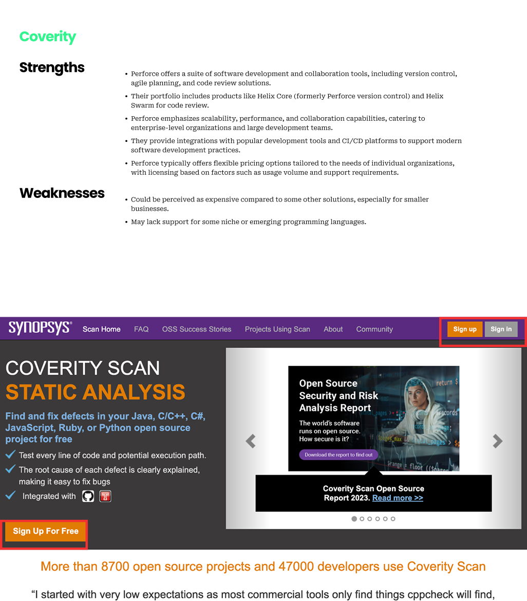
UX audit and competitive research, including benchmarking key cybersecurity competitors like Fortify, SonarQube, Coverit, and Perforce.
Information architecture redesign to simplify navigation and enhance content clarity.
Wireframes and high-fidelity prototypes in Figma, tested with stakeholders.
Product structure transformation, replacing subproducts with tiered plans (HealthScan, Essentials, 360) aligned with customer expectations.
Close collaboration with development to ensure a pixel-perfect and SEO-friendly WordPress implementation.
My Design Process


DataOpus original website

DataOpus original website
Discovery Phase
Stakeholder Interviews
To align the design strategy with business priorities, I conducted in-depth interviews with internal stakeholders, including the CEO, product owner, and sales lead. My goals were to understand what success looks like, who our ideal users are, and how the current website was falling short.
“We want users to feel that we understand cybersecurity, not just sell tools.”
“Clarity and credibility are more important than visual complexity”
“Users must trust the platform enough to schedule a demo”
Empathy Map
I created an empathy map based on the proto-persona “Sarah,” a cybersecurity lead in a federal agency, and validated it through stakeholders interviews and existing data.
Competitive Analysis
I analyzed five competitors—SonarQube, Checkmarx, Micro Focus, Coverity, and Fortify—to identify opportunities to differentiate DataOpus with a better UX.


Define Phase
Stakeholder Interviews
After consolidating findings from stakeholder interviews and user research, I entered the Define phase. This step was essential to distill raw data into actionable UX strategy. I focused on understanding user needs, mapping their journey with the platform, and structuring the site content accordingly.

Ideate Phase
Stakeholder Interviews
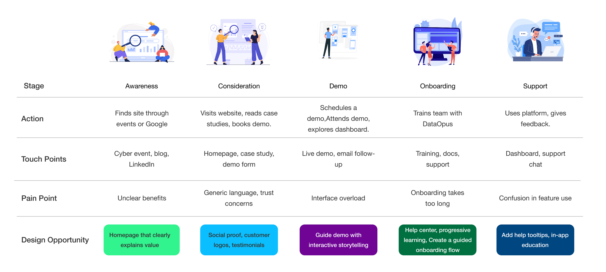
With user needs clearly defined, I moved into the ideation phase. This stage focused on transforming Sarah’s journey and mental models into structured, intuitive interactions. I developed the Information Architecture, Site Map and User Flow to ensure she can quickly find what she needs, trust the product, and book a demo with confidence.
The original site lacked a clear structure, often overwhelming users with dense technical jargon and scattered CTAs. I redesigned the information architecture to prioritize discoverability, trust-building, and fast access to demos.


Prototype Phase
With the structure and user flows defined, I moved on to the prototype phase. This was where strategy met interface. I translated the information architecture and user goals into interactive prototypes to test structure, clarity, and usability. The interactive prototype in Figma allowed the stakeholders to explore the main flow: from homepage to demo request. This version included hover states, transitions, and error handling for form validation.


Test Phase
With the high-fidelity prototype finalized, I conducted usability tests with 3 participants representing our target audience — cybersecurity professionals, our sales team, and decision-makers in critical infrastructure sectors. My goal was to verify the clarity of the value proposition on the homepage, test the flow for scheduling a demo, assess the readability of technical content
“I liked the clarity, and demo button that appears earlier.”
“I wasn’t sure what’s included in each plan.”
“I’d love to see more real-world examples.”
Feedback Implementation
Designed a visual comparison table for HealthScan, Essential, and 360 plans
Prioritized adding real use cases for the next design sprint ( For now, users have access to some real examples on demos)
Measurable Results
Following the launch of the redesigned website, the results validated our design and content decisions. The simplified structure, progressive pricing plans, and focus on visual trust delivered tangible business impact:
+ 50% Increase in demo requests ( Current we have the Wind 64 version on demo and Cloud version is on production, coming soon)
Investor Interest One investor reached out after visiting the new website, reinforces that design can drive business conversations, not just user conversions
User Feedback Highlighted clarity, ease of navigation, and a trustworthy professional look
Lessons & Next Steps
Design doesn’t end at launch, with the live site generating real engagement, we continued improving through testing and iteration. Future steps include:
Ongoing A/B Testing for CTAs, headlines, and content order
Social Proof Expansion, with more real-world use cases
Content Optimization based on performance analytics
Internationalization, including EN/AR translations


