DataOpus Platform
From a dense legacy desktop tool to a modern, scalable cloud SaaS.
Timeline: 12 months My role: Product Designer Responsibilities: Design leadership, design and deliver new Product
Team: CEO, Engineering, Sales Client: DataOpus
Overview
DataOpus scans databases and surfaces hundreds, sometimes thousands, of resiliency findings. But the value was never in the findings themselves. It's in helping technical teams understand and prioritize what to actually fix first. I came onto the project when it was still the legacy Wind64 desktop app, and I owned design across two phases: first making the existing tool usable, then transforming it into a cloud platform with a full subscription model.
Wind64
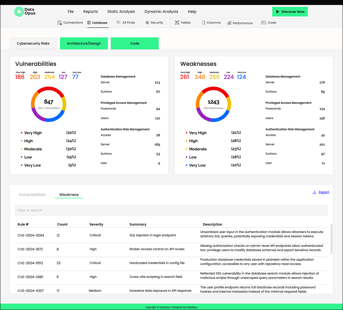
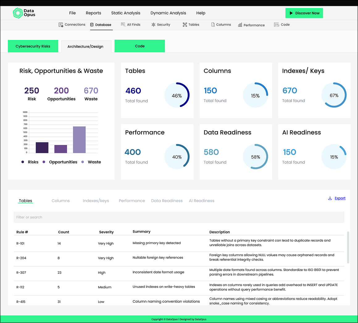
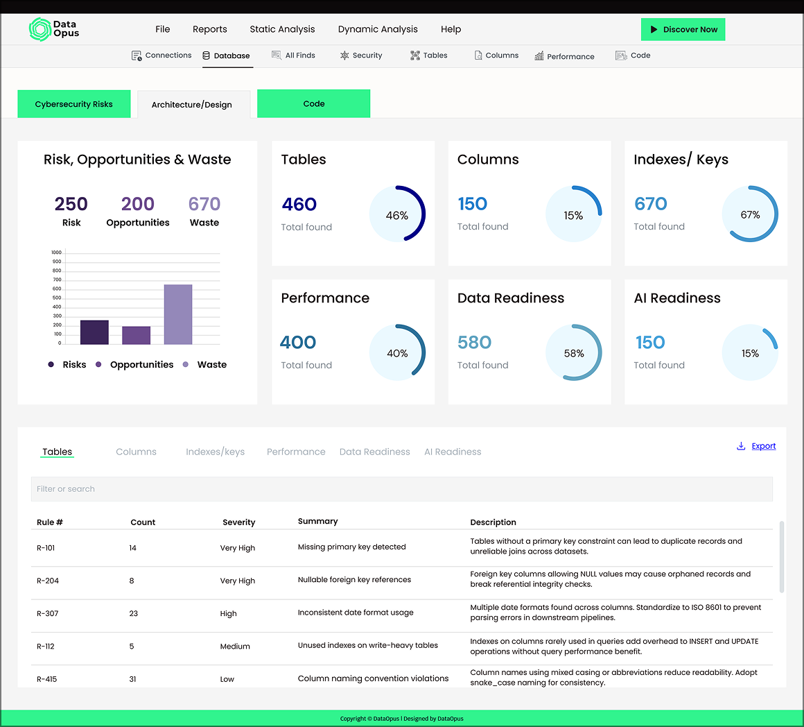
Redesigned Screen
Phase 1 - Redesign the experience
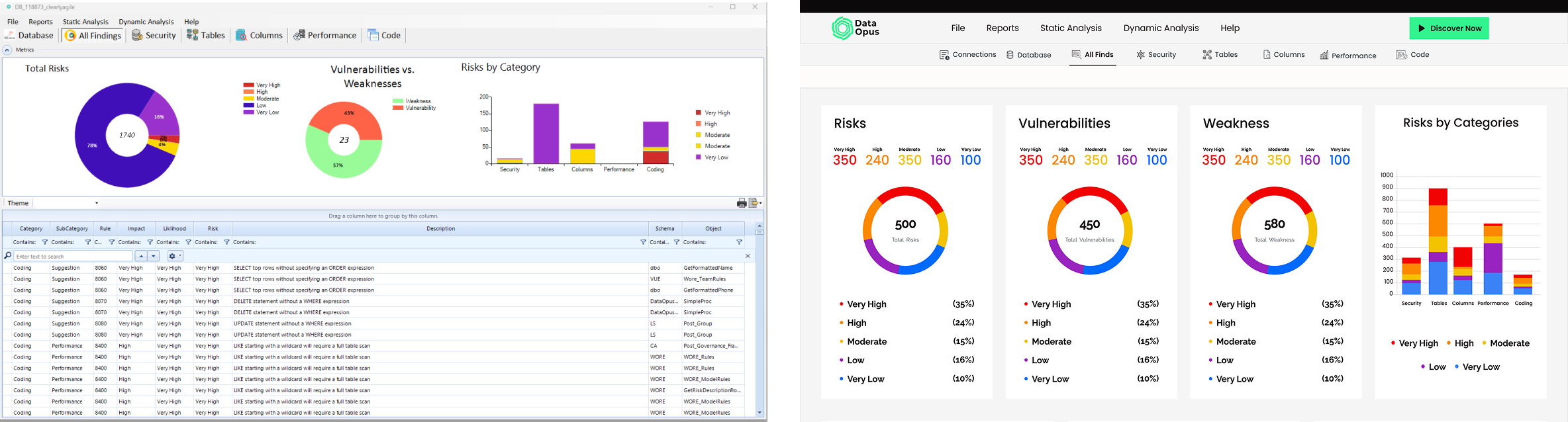
Wind64 buried its own value under raw data. Picture around 1,740 findings crammed into dense, spreadsheet-style grids, with risk shown as an abstract gauge that just read "33%," a mix of chart styles that didn't talk to each other, and no real hierarchy. Users could see everything and prioritize nothing.
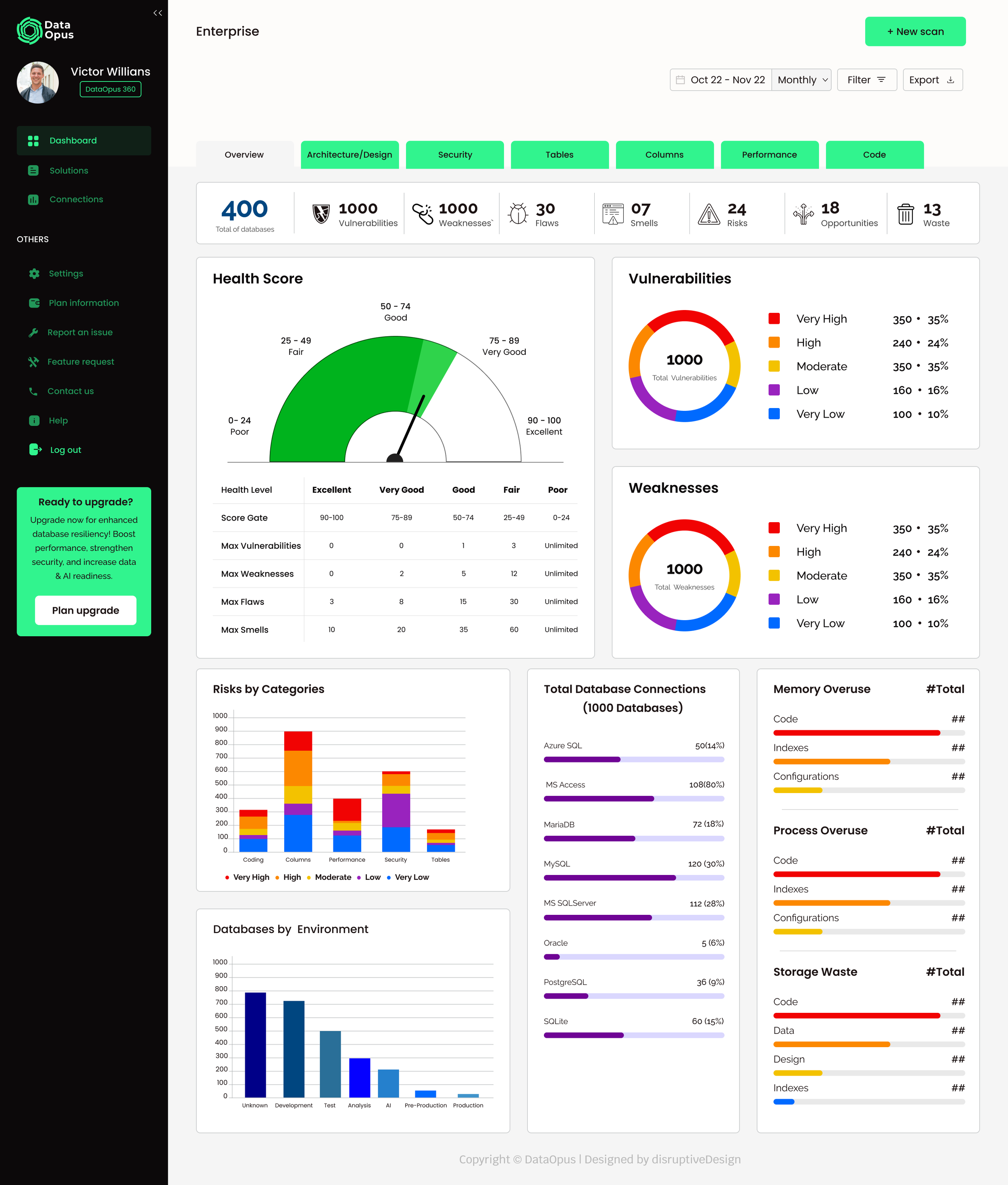
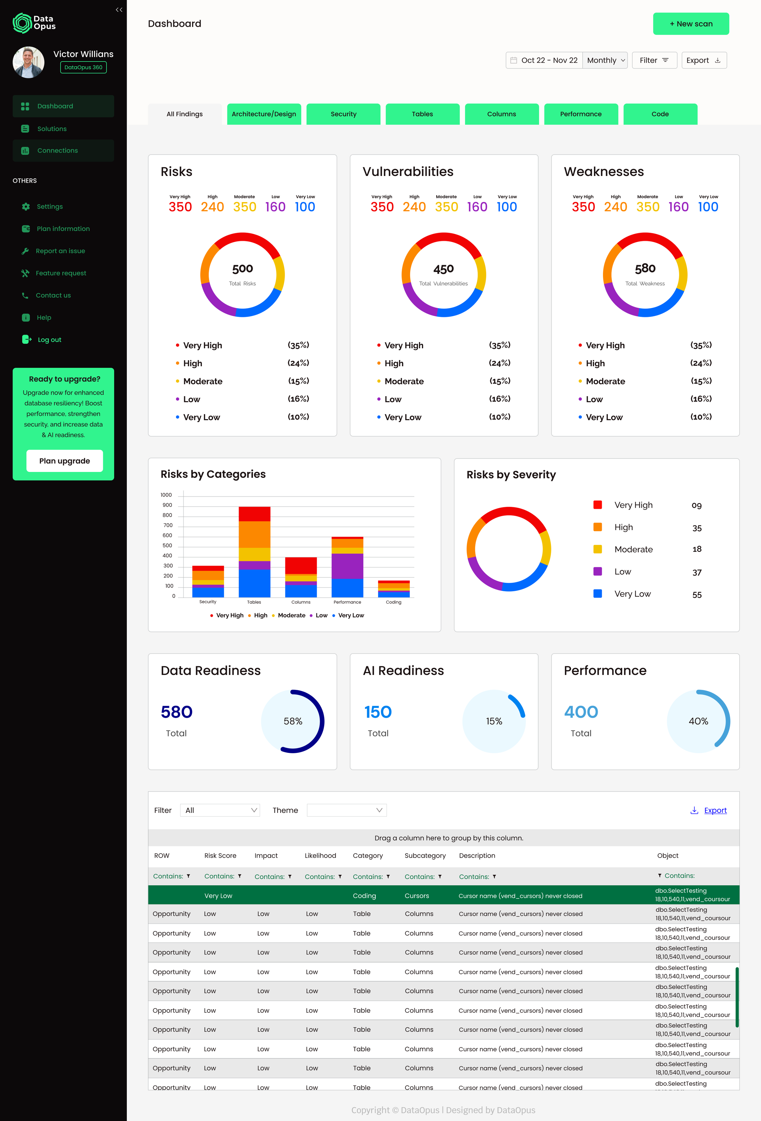
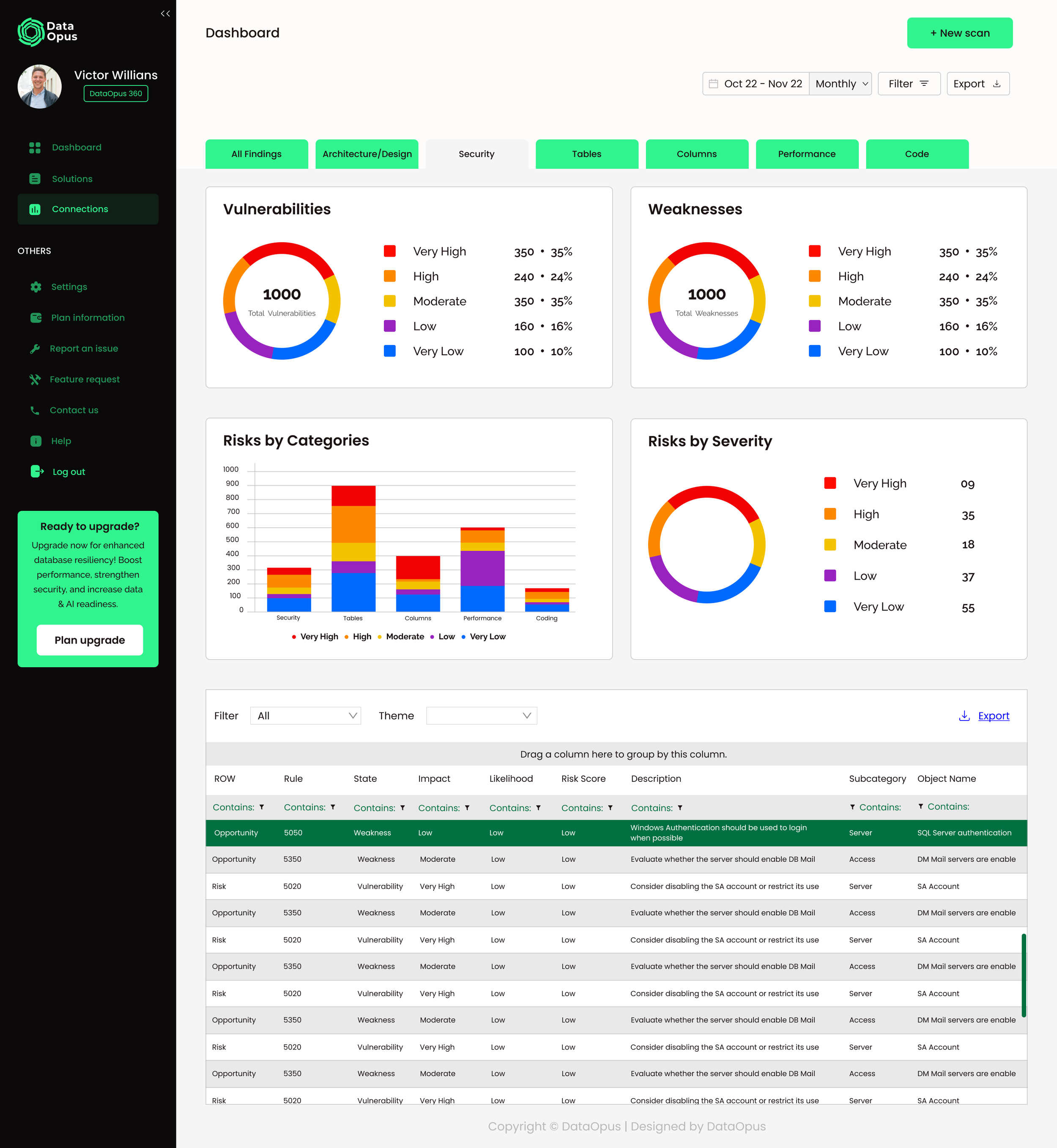
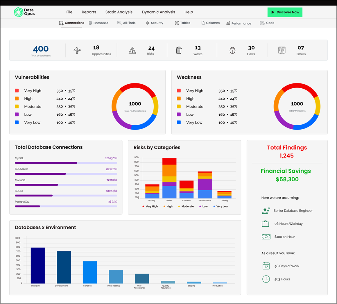
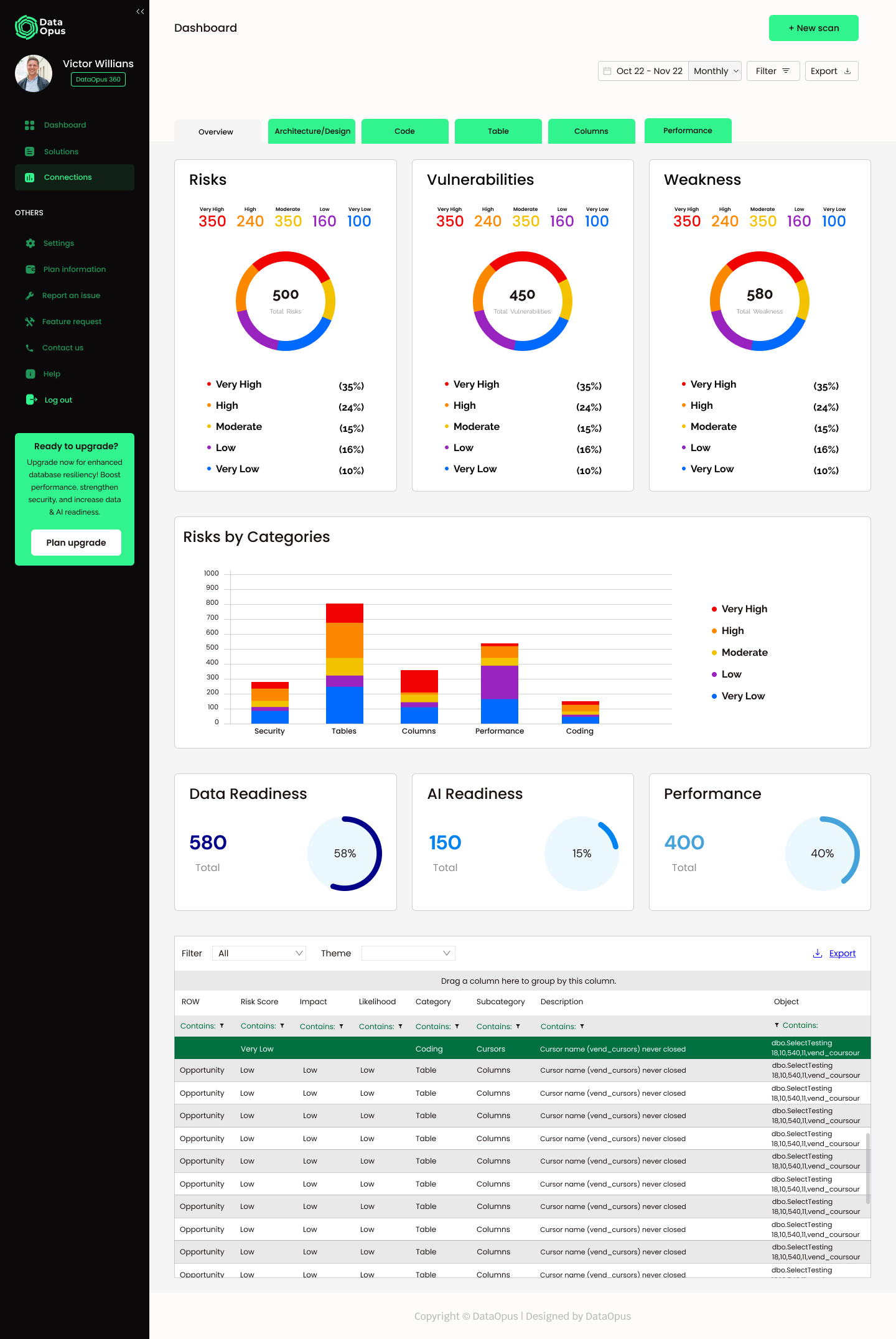
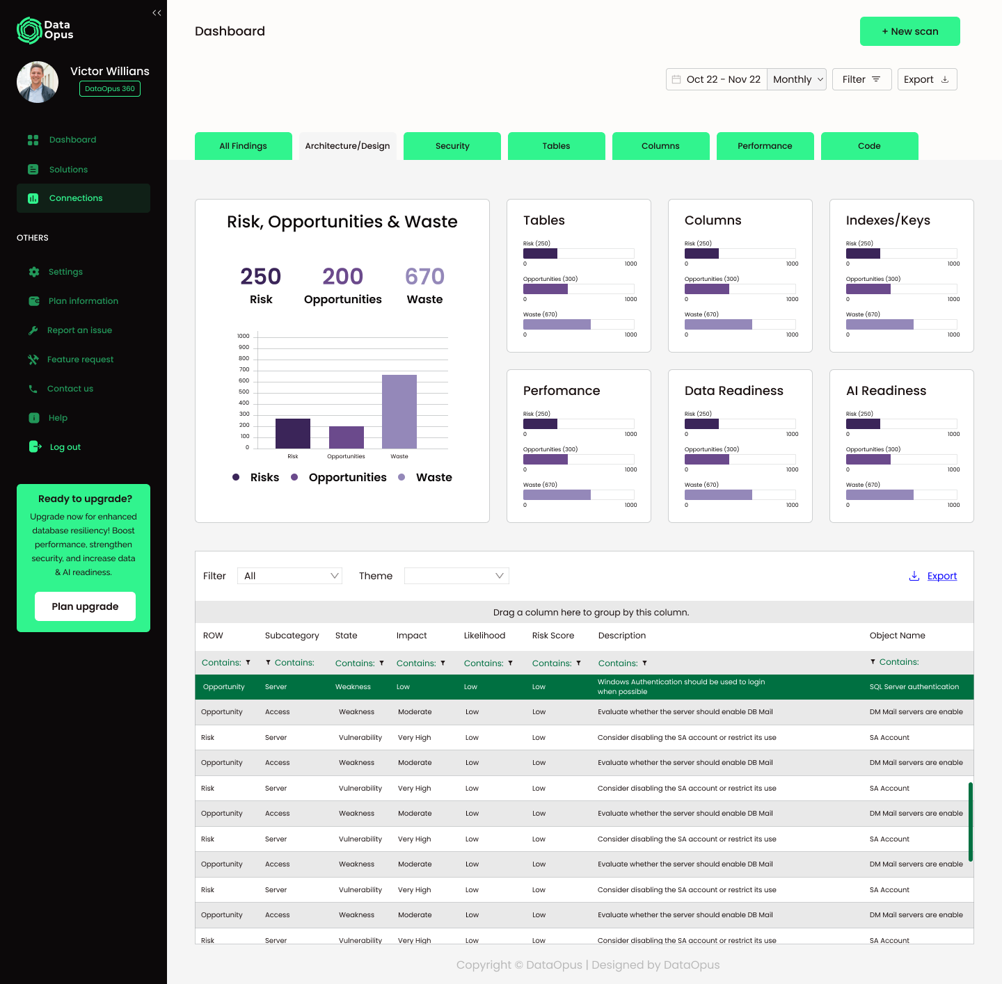
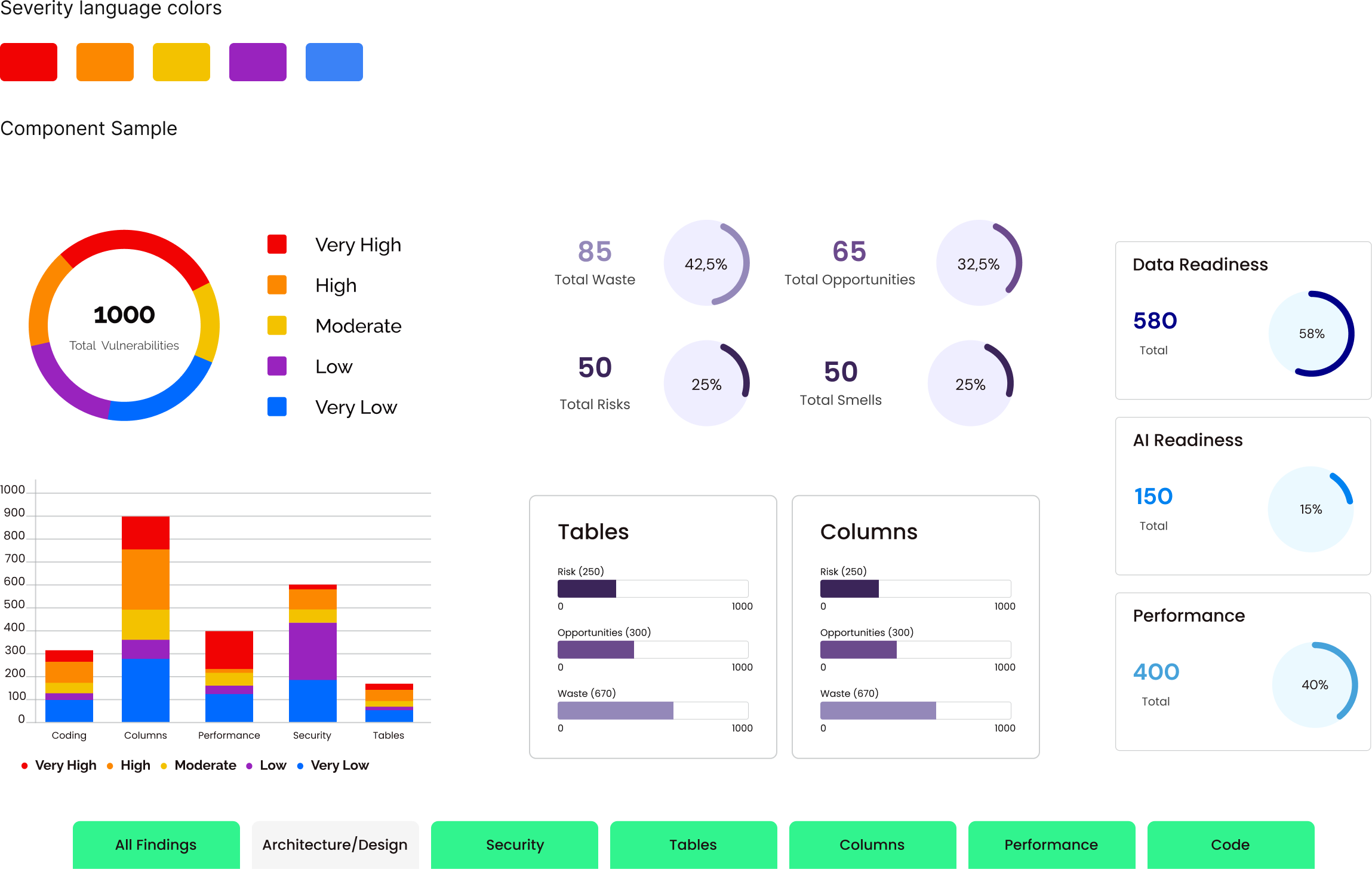
So I gave the data a language. I introduced a single severity system, a consistent Very High to Very Low color scale running across every screen, which turned thousands of raw findings into something you could actually scan and act on. I restructured the tool around how teams really work (Security, Tables, Columns, Performance, Code), let it open with the big picture and drill down from there, and translated the abstract into something human, framing savings as "98 days of work" instead of a number nobody could feel. Underneath it all, I built a reusable component system so the interface stayed consistent as it grew.
Phase 2 — Taking it to the cloud (DataOpus Cloud)
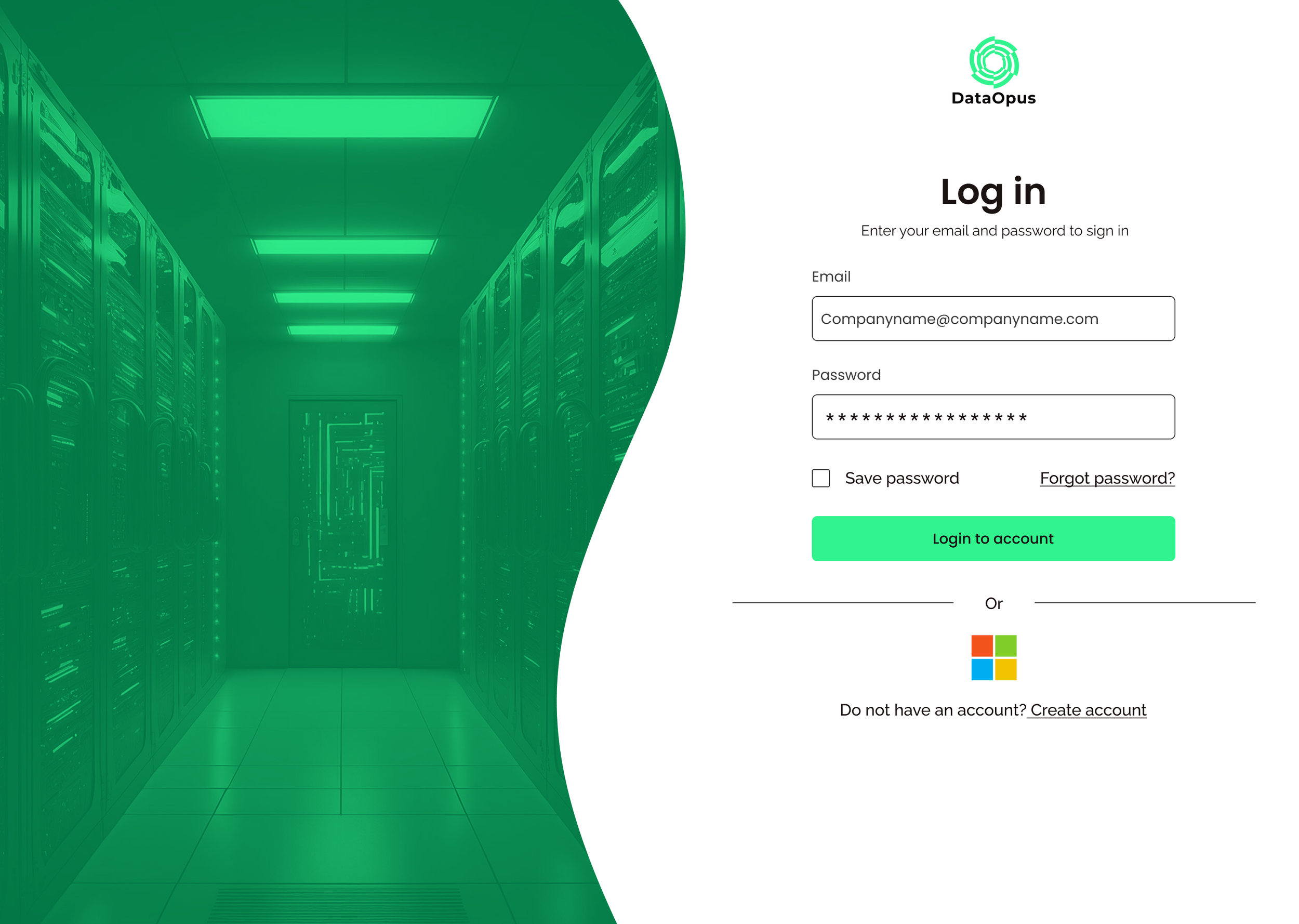
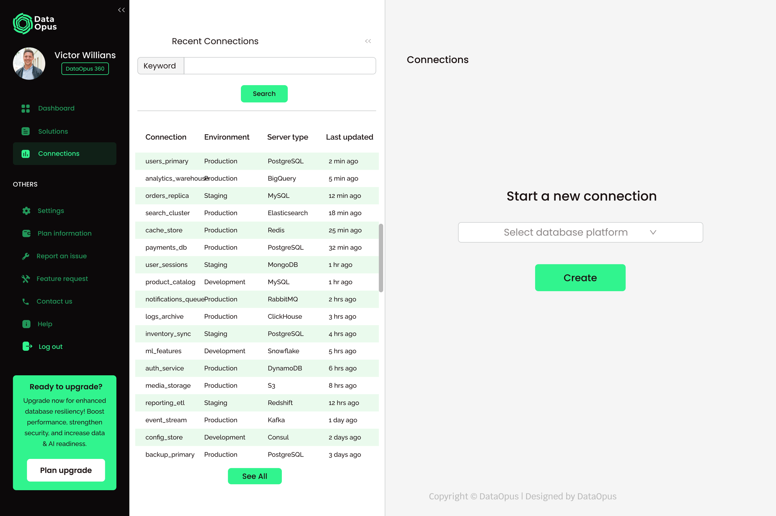
Once the experience was clear, I led the move to a cloud SaaS, and this time I wasn't just designing the core tool but the whole product around it. Working with the CEO, engineering, and sales, I shaped the cloud flow and added the pieces a real product needs:
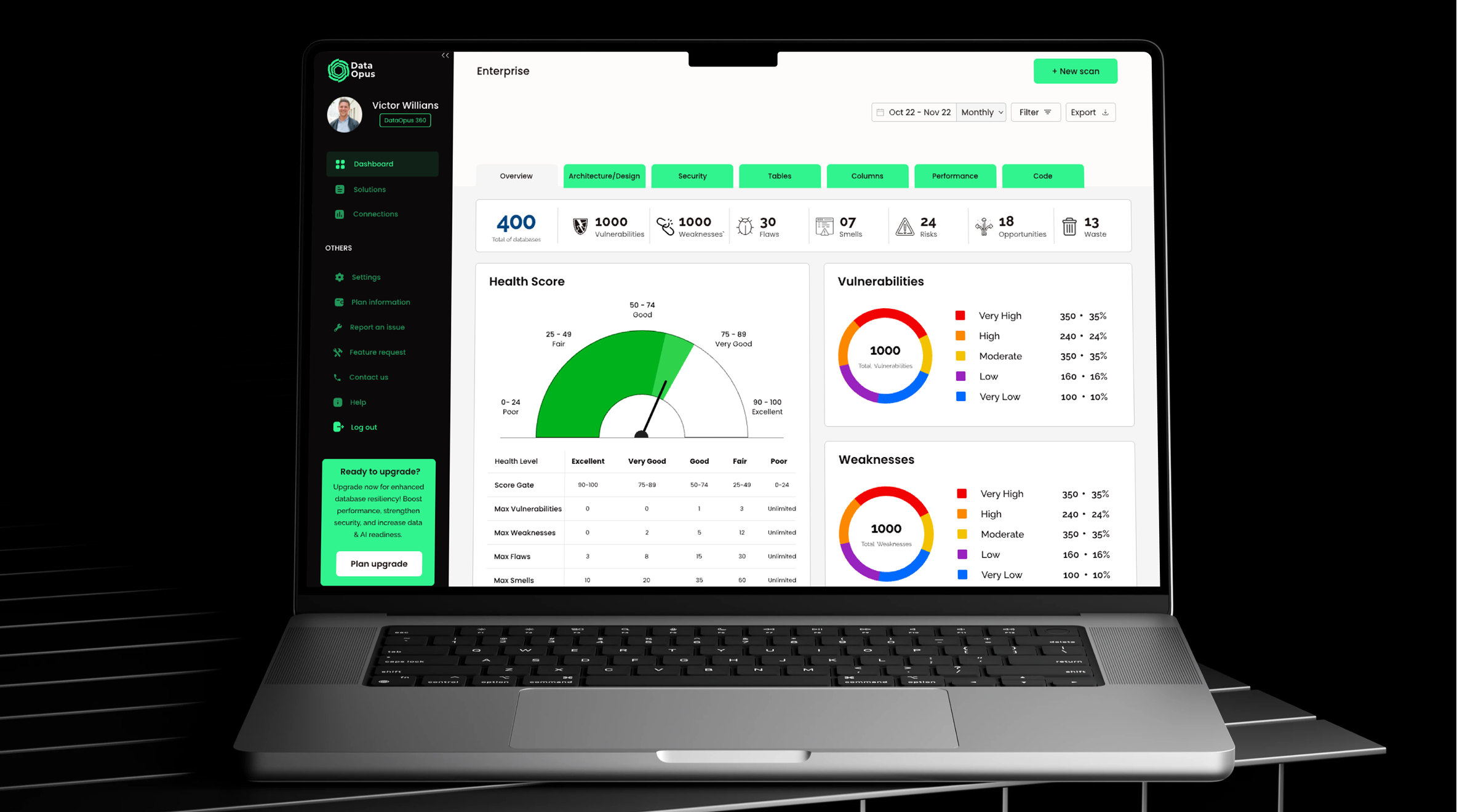
A three-tier subscription model built right into the experience, from a free tier up to full access, so the plans lived in the UI through locked insights and upgrade moments rather than sitting on a separate pricing page. The business model became part of the interface.
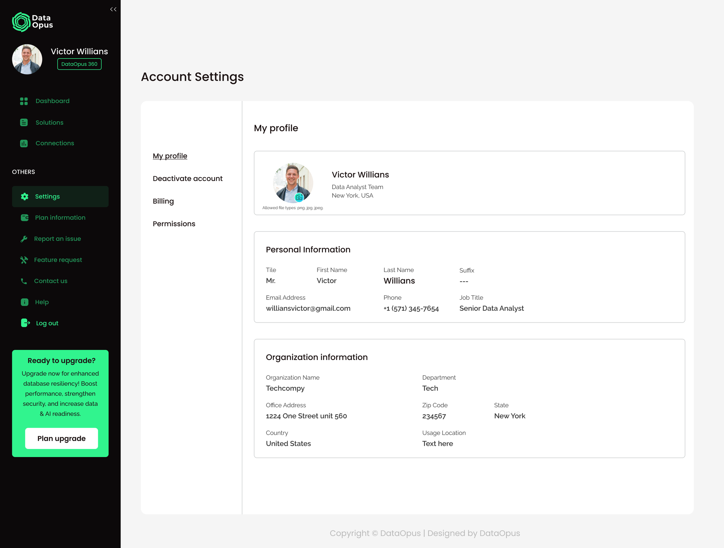
A Health Score that distills thousands of findings into one number anyone can read at a glance.
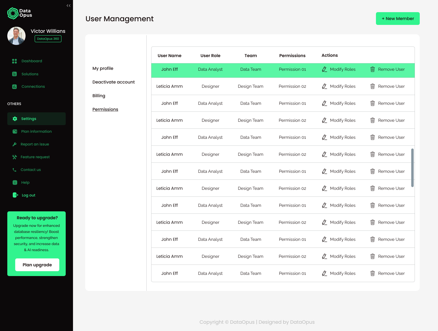
User and permission management for team accounts.
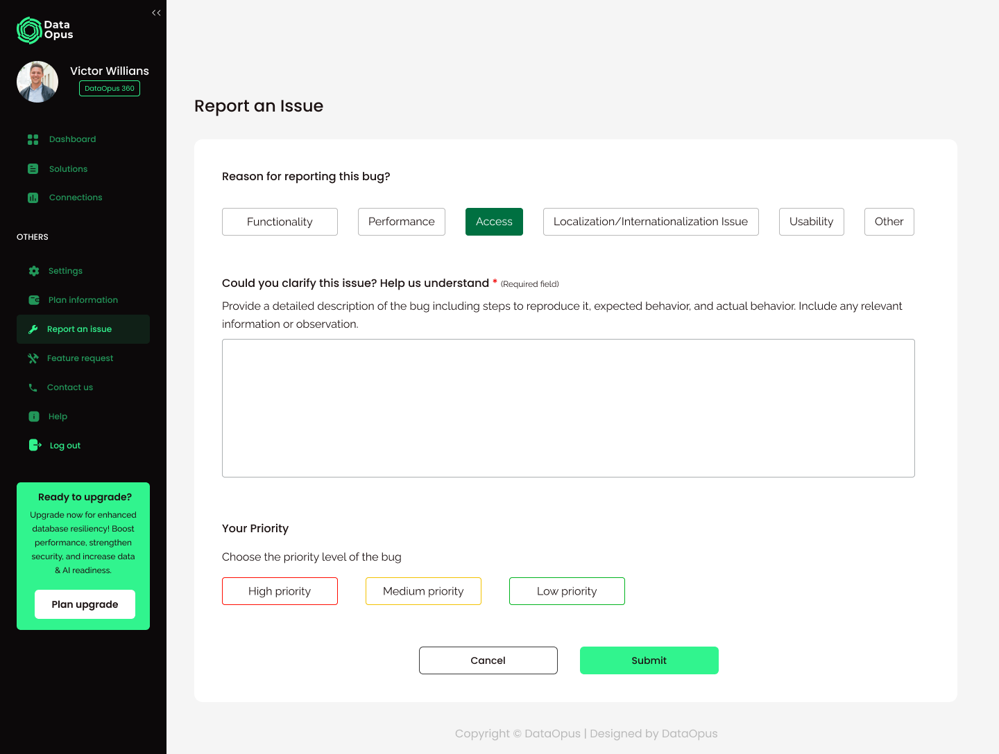
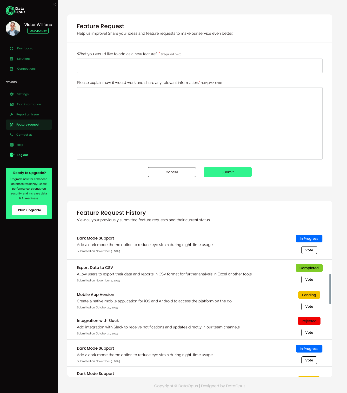
A feedback loop of its own, with structured issue reporting and a feature-request system people could vote on.
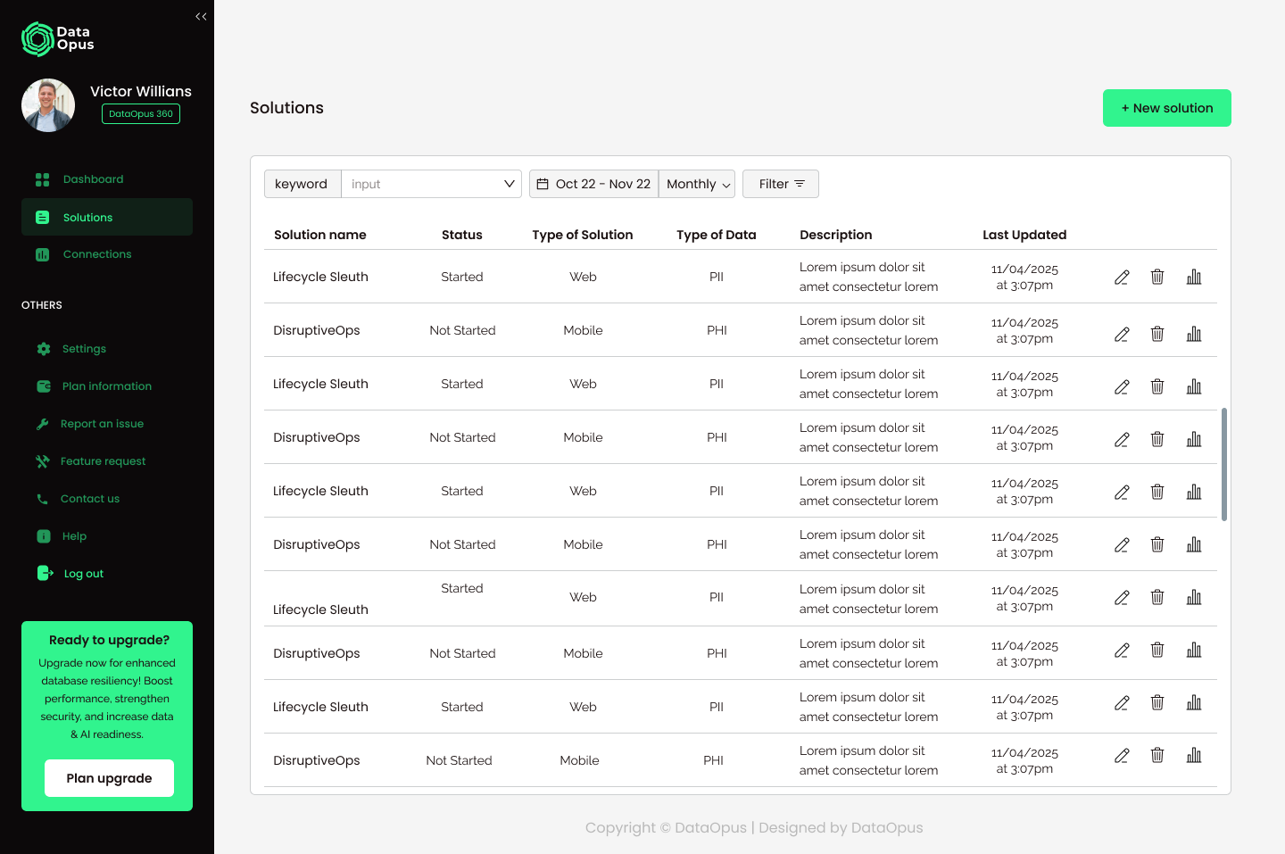
Solution tracking to manage remediation across web and mobile and different data types.
Recurring scans with date ranges and export.
All of it sits on a scalable design system I built in Figma and handed to engineering.
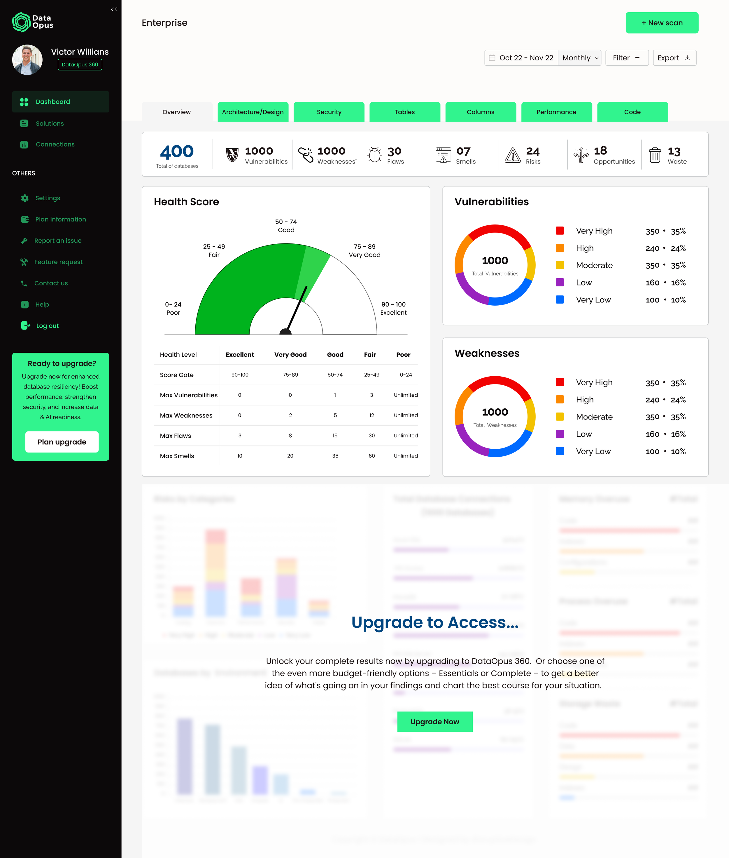
Severity system & reusable components
Key decisions
A few decisions carried the whole thing. The first was treating translation as a system: raw findings become a shared severity language, then a single Health Score, then savings measured in days and hours. Every layer turns complexity into a decision someone can make. The second was letting the business model become the interface, so the tiers weren't bolted on but designed in, the same tier logic I'd carried through the marketing site. And the third was designing the whole product, not just the tool, from onboarding the team to closing the loop to tracking outcomes.
The product model
Working with sales, I structured the three tiers: HealthScan for free, basic access, Essentials for a bit more, and DataOpus 360 for everything.
Impact
DataOpus Cloud is live in production. As the only designer on it, I structured around 40 screens and a reusable component system that let the same patterns scale across the product, so the charts and tables powering the Code view are the same ones running Performance and everything else. It stayed consistent as it grew.
What I'd do differently
Working solo and moving fast, I designed a lot of this from stakeholder and sales input. If I did it again, I'd get real technical users, the DBAs and security folks, into usability testing earlier, so I could pressure-test the prioritization flows before the build instead of after.