DataOpus Website
Turning a complex database-resiliency platform into a clear, credible digital experience.
Timeline: 6 months My role: Product Designer (Sole Designer) Responsibilities: Design leadership, design and deliver new Product
Team: CEO, Engineering, Sales Client: DataOpus
Overview
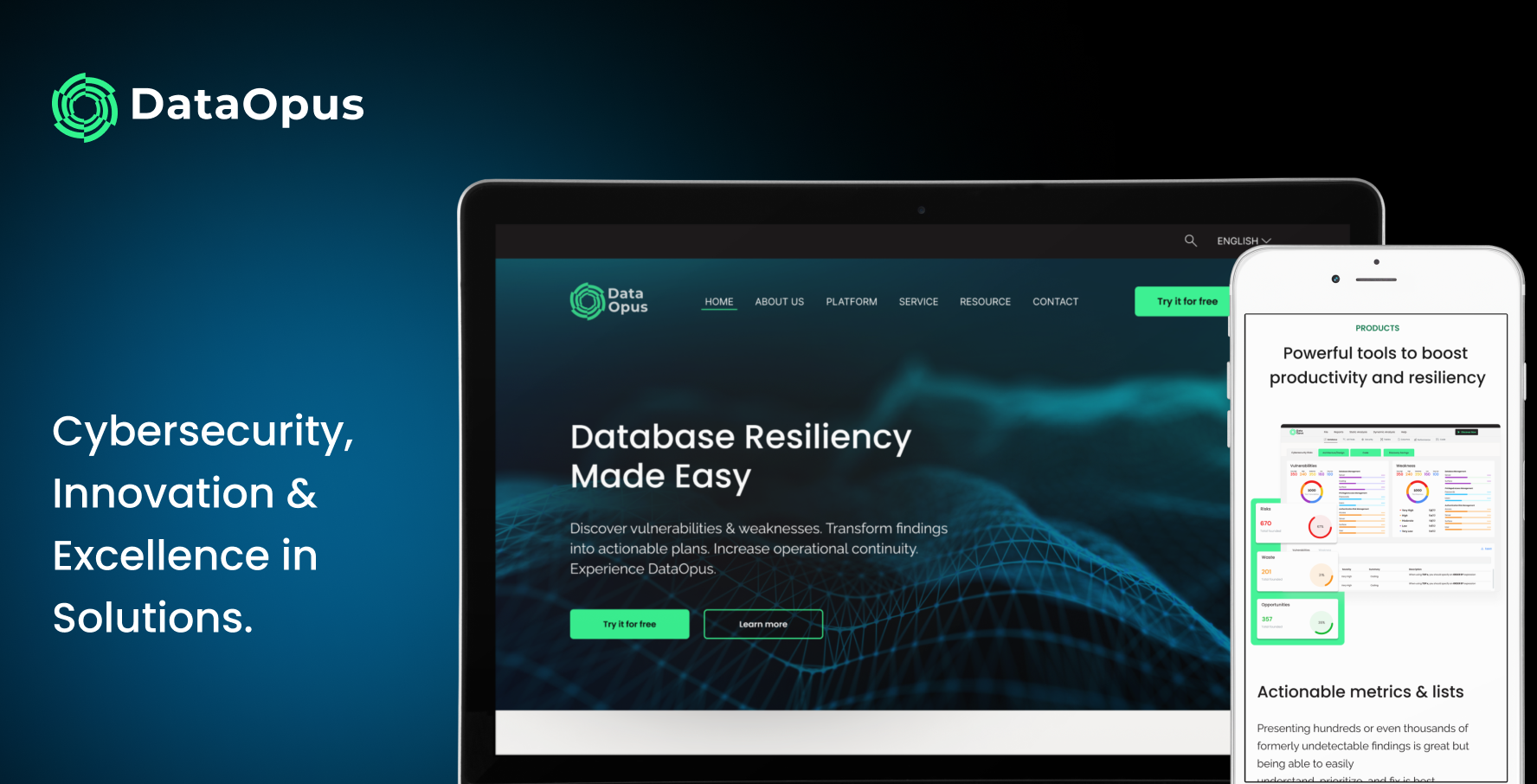
DataOpus is a database-resiliency and security platform that helps organizations find, prioritize, and fix vulnerabilities across their databases. When I joined, the site just couldn't get that across. The messaging was buried in technical language, the structure was hard to follow, and most visitors left without understanding what DataOpus actually did or who it was for. I teamed up with the CEO and sales to rethink the whole experience, from the information architecture to the content strategy to the visual design.
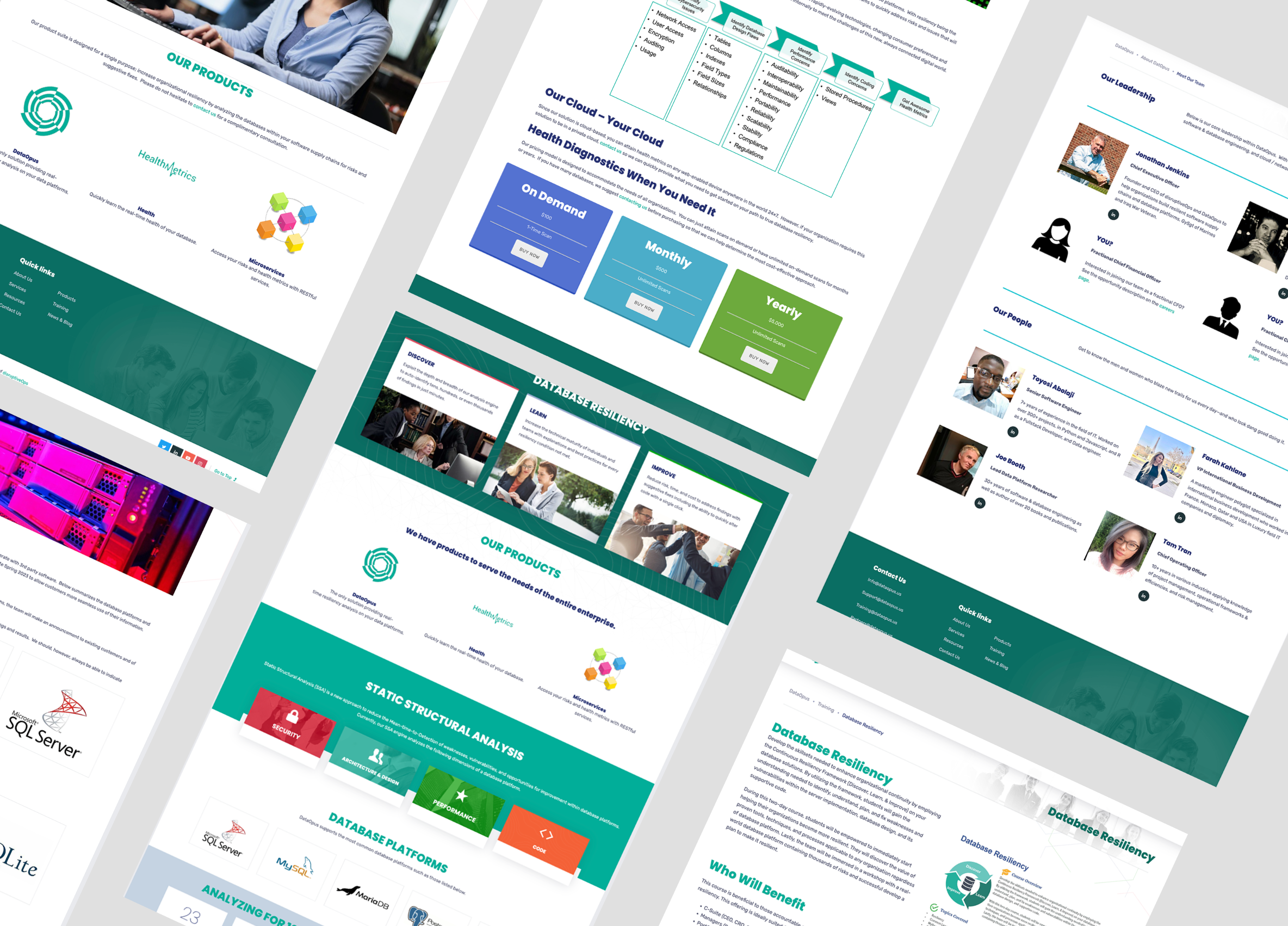
Before
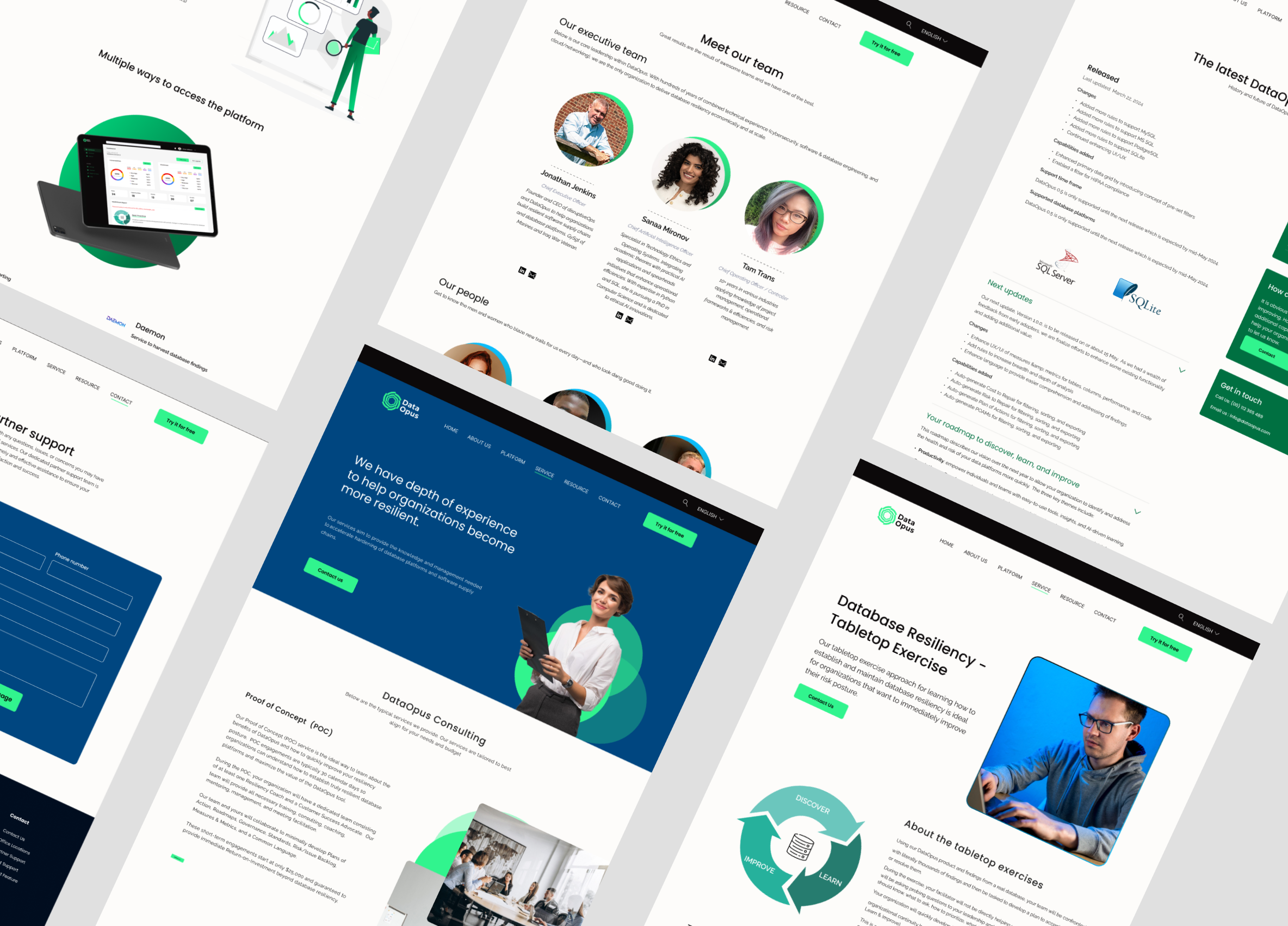
After
The challenge
When you're selling to enterprise and critical-infrastructure teams, you have to earn trust fast, and the old site was working against itself. The homepage opened with "Database Forensics for Real-Time Health Metrics and Remediations," which told you almost nothing unless you already knew the product.
The technical content wasn't organized around what users actually needed, stock photos and evenly-weighted product lists gave no sense of what mattered most, and nobody could tell who the product was built for. So the real goal wasn't a prettier interface. It was a clearer story.
My role
I led the redesign from UX strategy all the way to final UI, covering the information architecture, content direction, hierarchy, visual design, and responsive layouts. I designed the whole site in Figma, worked closely with the CEO and sales on the messaging, and then partnered with engineering on handoff and implementation.
Understanding the product and audience
I started by sitting down with stakeholders to map out what the product could do, where the business wanted to go, and what sales actually needed on the ground. From there I defined the core audiences: database administrators, cybersecurity teams, IT managers, technology leaders, CISOs, and critical-infrastructure professionals.
Building a product narrative
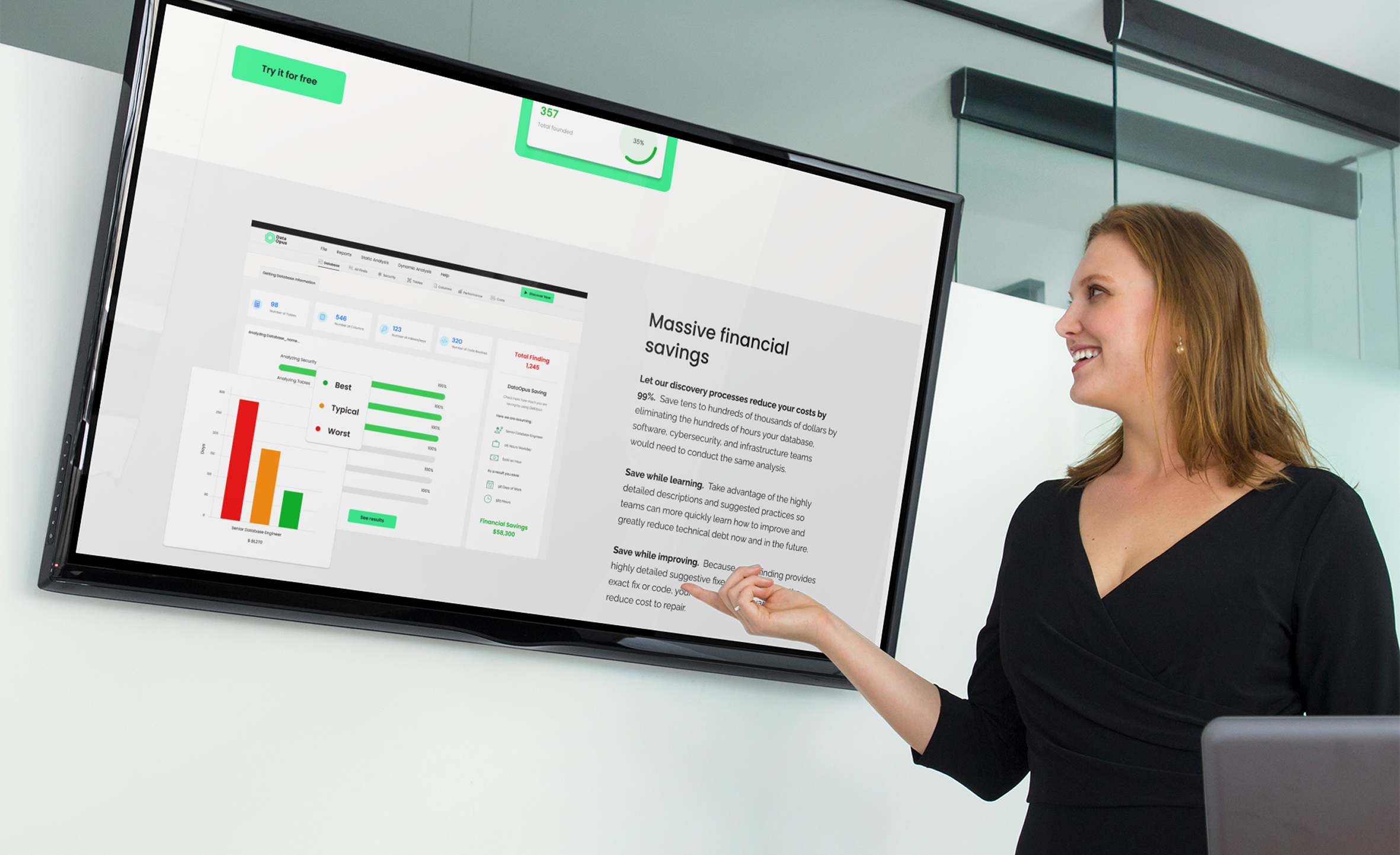
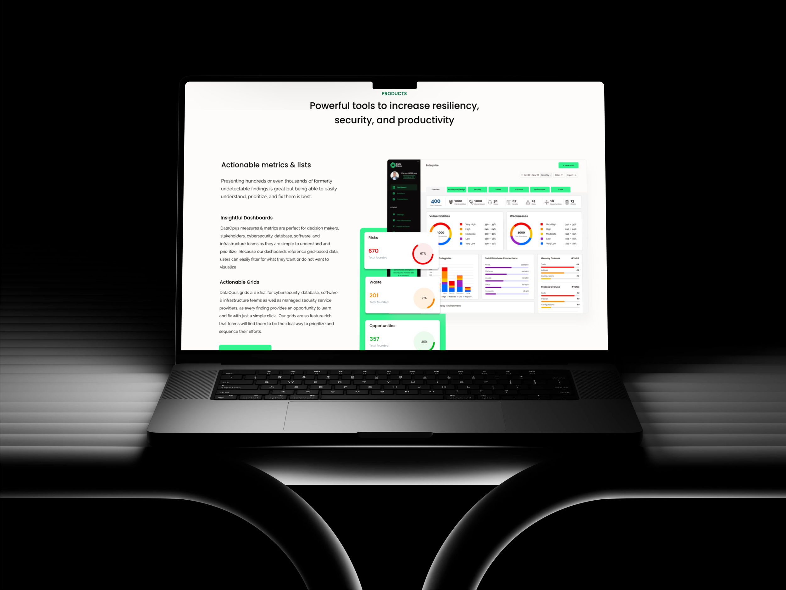
Then I rebuilt the site around the questions people really ask about a complex enterprise tool: What is it? Why does it matter? How does it work? Who is it for? I structured everything around the product's own logic, Discover → Learn → Improve, and added industry segmentation so different visitors could immediately see themselves in it. Jargon gave way to plain business value ("reduce costs by up to 99%"), and instead of promising, I showed, putting the real dashboards and grids right on the page as proof.
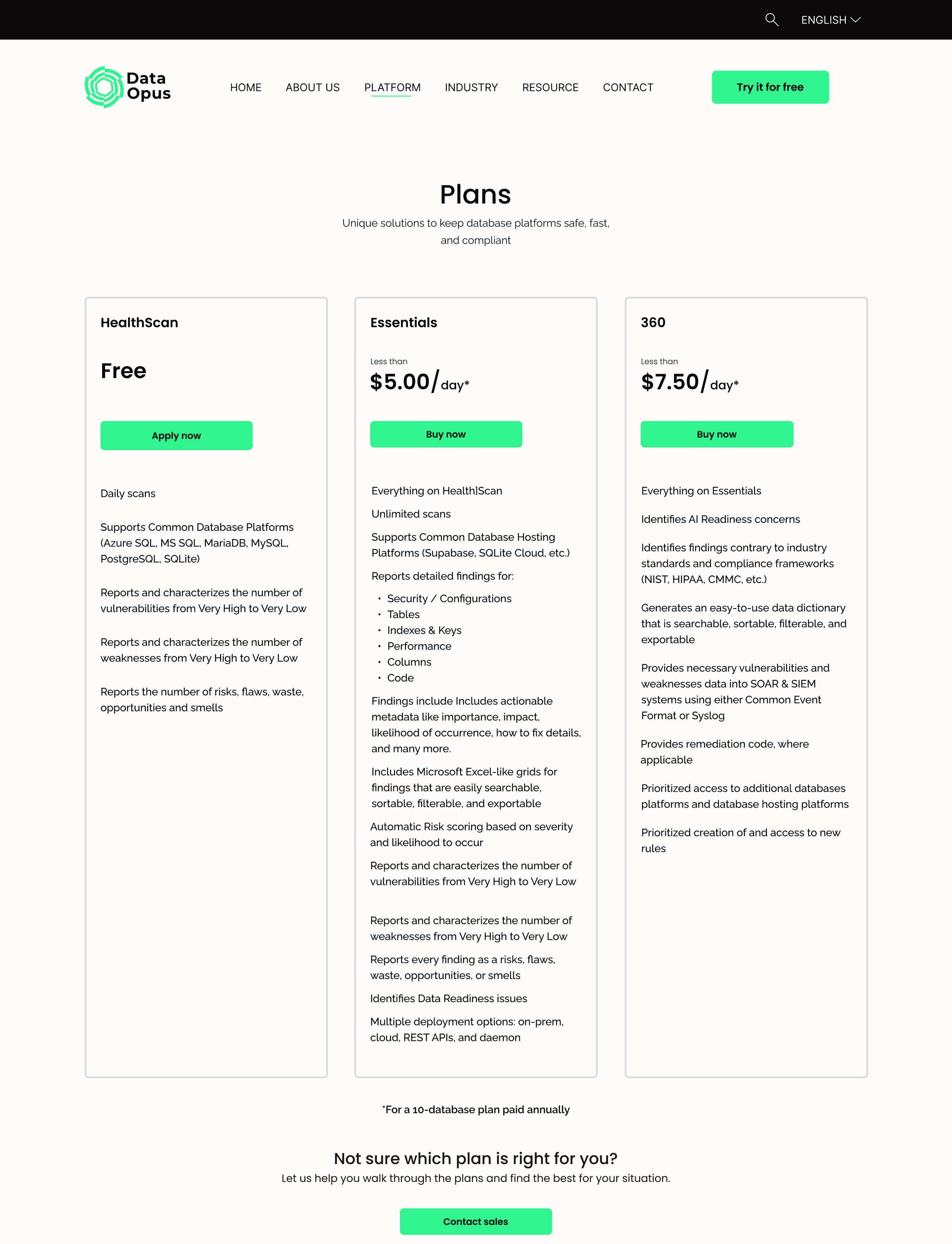
Working with sales, I designed the three-tier structure: HealthScan for free, basic access, Essentials for a bit more room to explore, and DataOpus 360 for the full picture.
Final solution
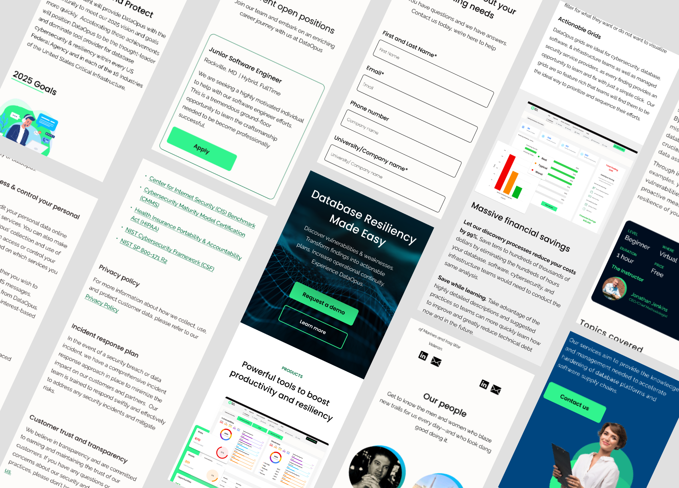
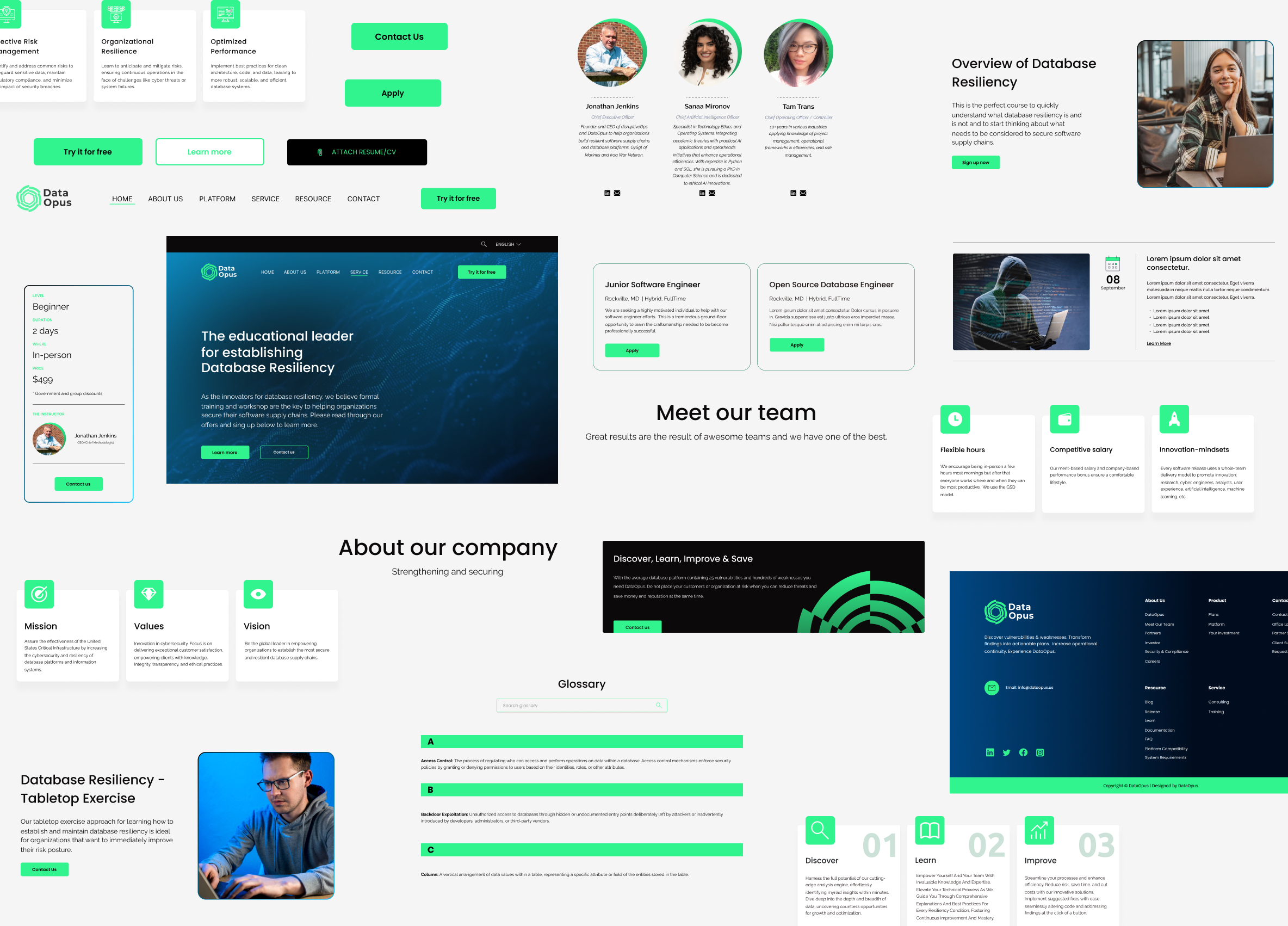
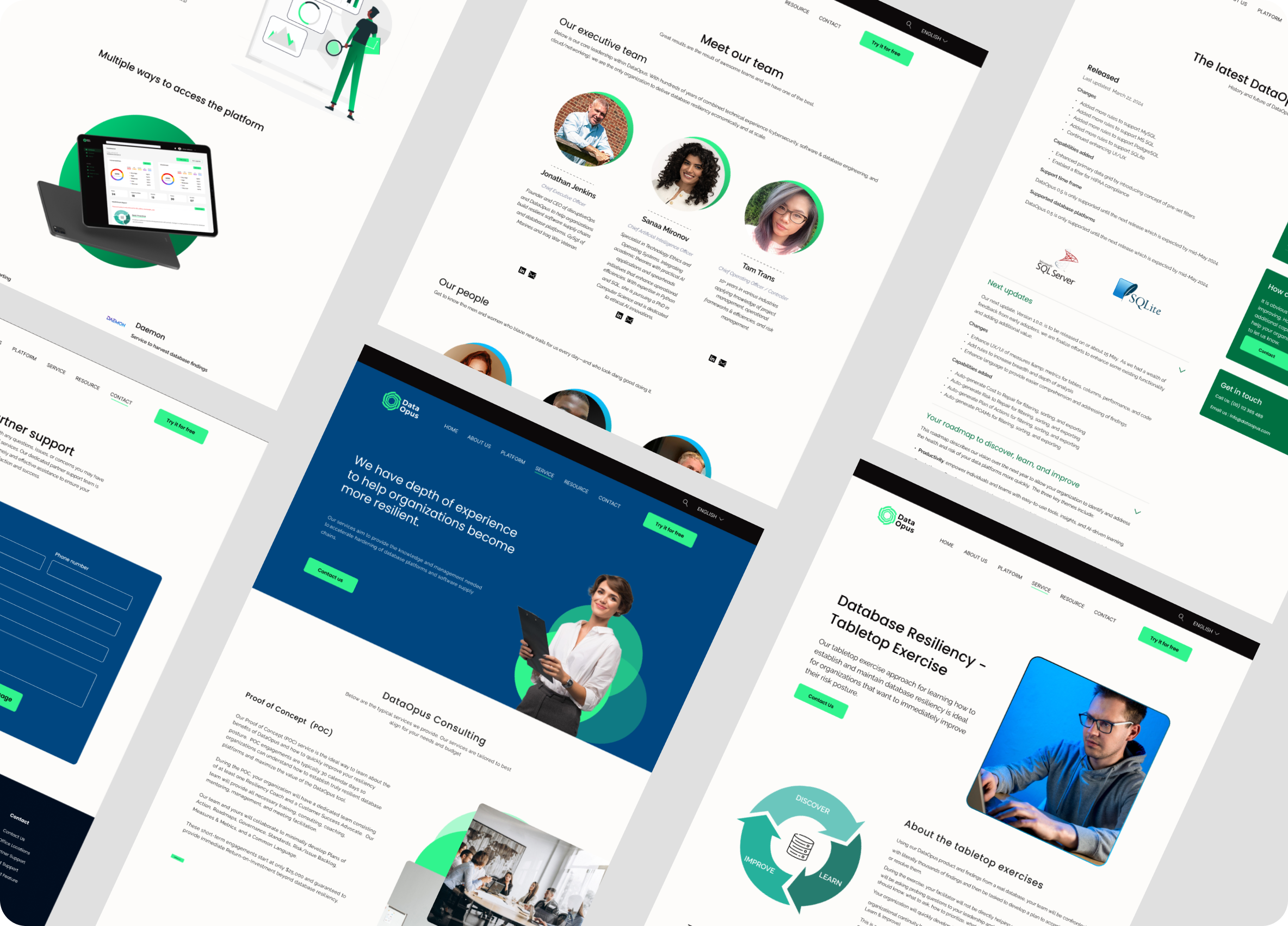
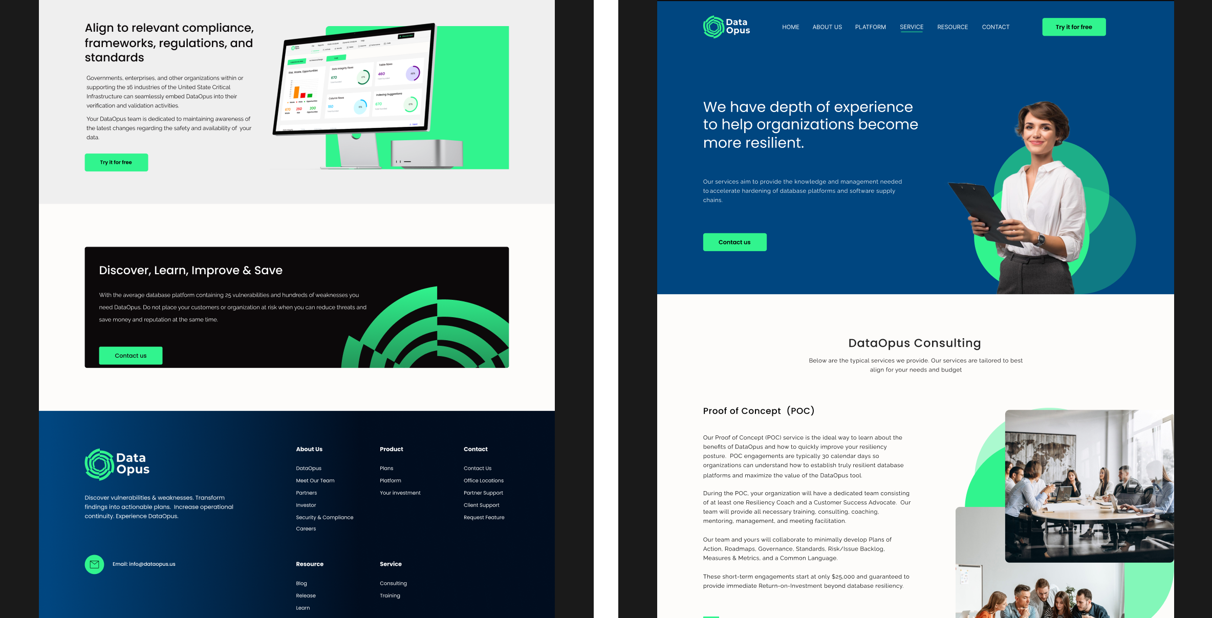
The finished site came together in Figma as a scalable, reusable structure, from the information hierarchy and navigation to the responsive layouts and UI. I handed off detailed specs to the dev team for the WordPress build. What came out of it was a clearer hierarchy, positioning that spoke to specific industries, and a foundation the team could keep building on.
Impact (in the year after launch)
Demo requests climbed around 50%
Website traffic roughly doubled year over year, led by growth in the US
It sparked early conversations with potential customers and an open one with a potential investor, which was design driving real business conversations, not just user clicks
And the feedback kept landing on the same words: clear, easy to navigate, and genuinely trustworthy
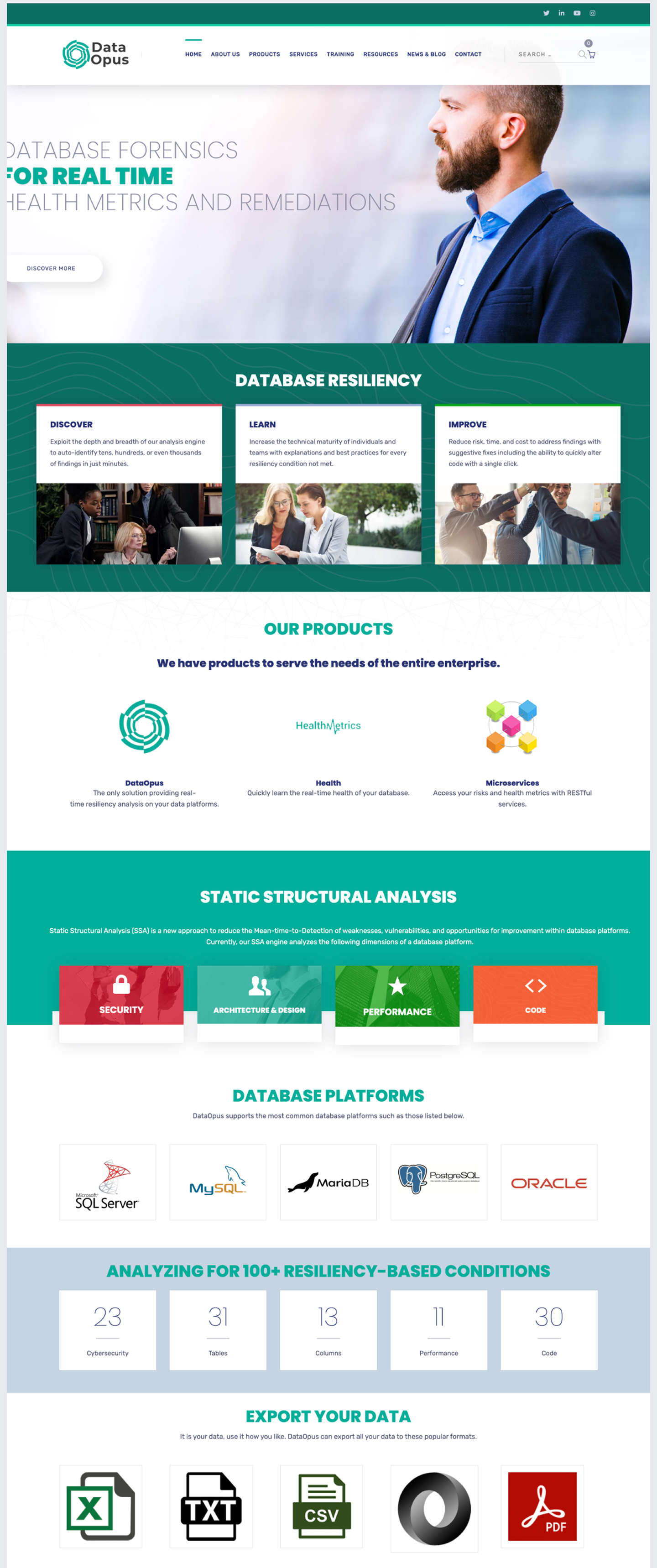
The subscription model
Before
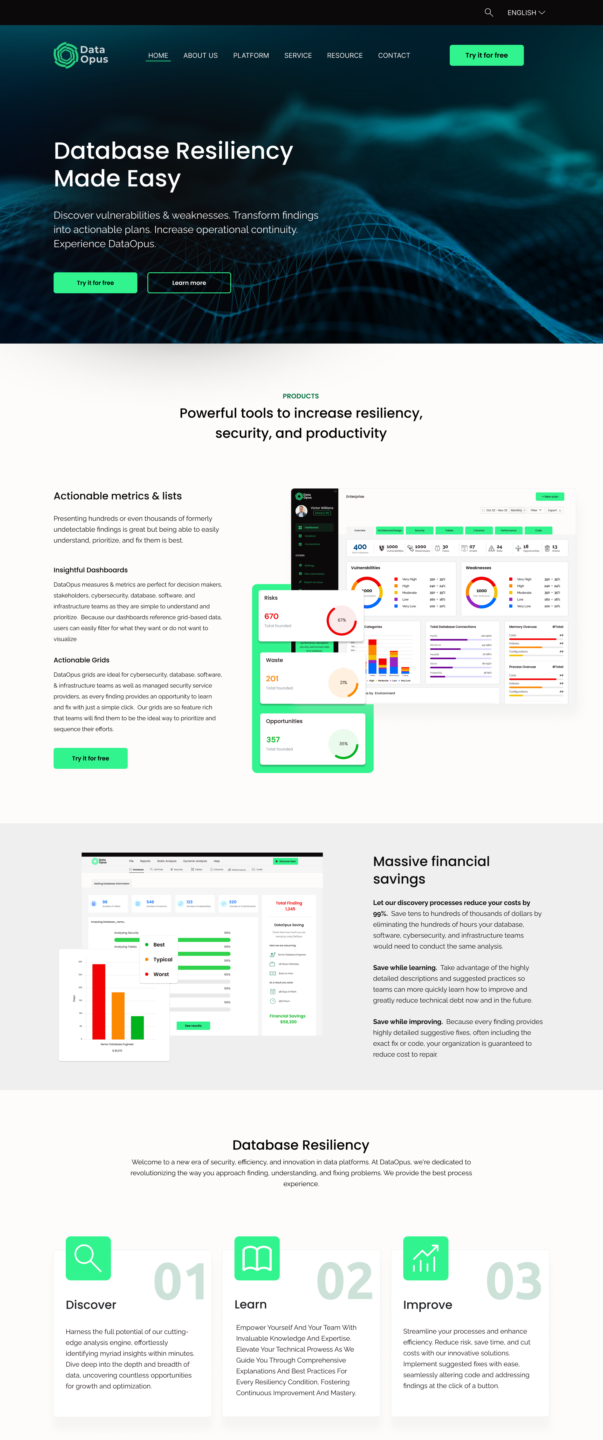
After