Eleva - Brand identity & Website
Translating a founder's vision into a complete brand and digital experience.
Timeline: 3 months
My role: UX/UI Designer & Brand Designer
Responsibilities: Design leadership, design and deliver new Product
Team: Karen Banci (Dev)
Client: Babi Santos

Overview
Eleva is a personal-development program for women in their thirties, forties, and fifties, a twelve-week method that works across four areas of life: health, relationships, career, and finances. It grew out of its founder's own transformation, which meant the brand had to feel personal and holistic without ever getting soft or vague. My job was to take something deeply personal and turn it into a coherent brand and a digital home that felt premium and human, all starting from a blank page.
The Challenge
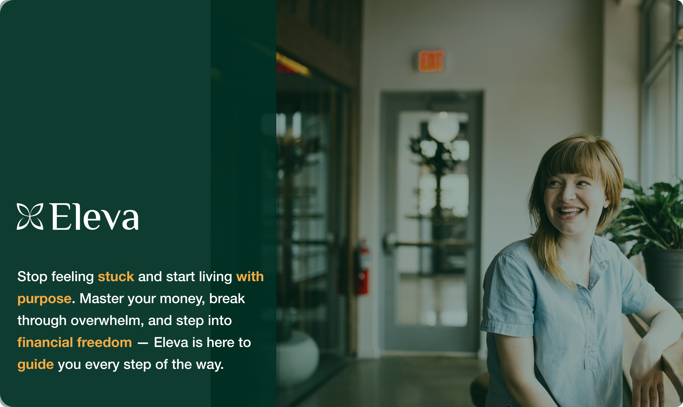
There was no existing identity to build on, so everything started from zero. I had to translate a founder's vision and values into a visual language, and then translate that language into a website that could guide a busy, discerning audience from "just curious" to "ready to sign up," all without ever feeling like a hard sell.
The role
I owned the whole thing, from strategy to identity to product. I created the brand from scratch and designed the full website, working solo and moving from the founding idea all the way to the launched site, with a developer handling the final build.
The process
The work was really one long act of translation, moving from vision to strategy to identity to product.
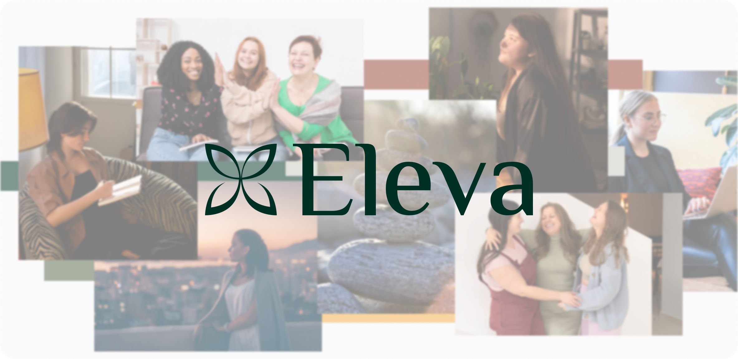
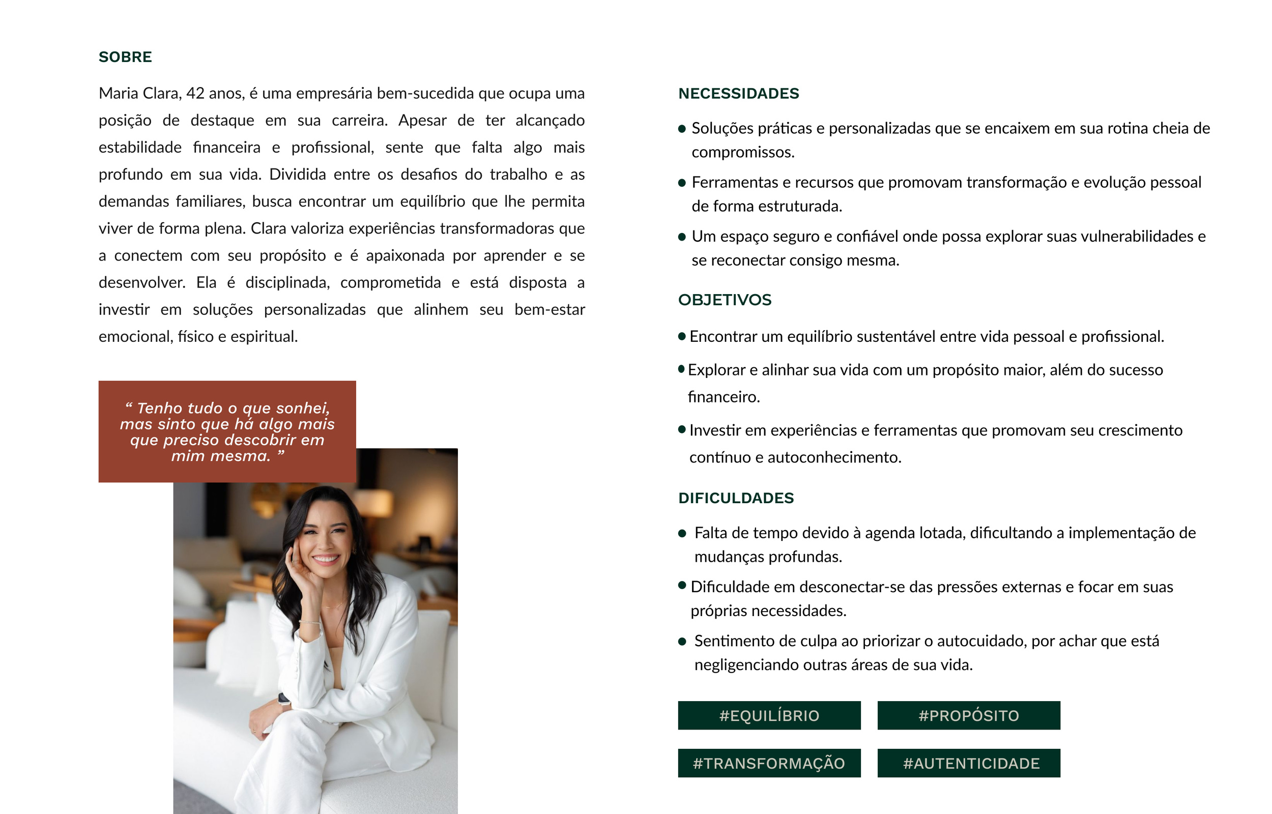
I started with the foundation. I defined the values that would anchor everything (self-awareness, balance, intentionality, authenticity, and growth), gave the brand a personality that was inspiring and welcoming but still sophisticated, and shaped a persona named Maria Clara, forty-two, successful, time-poor, and quietly sensing that something was missing. Every decision after that answered to her.
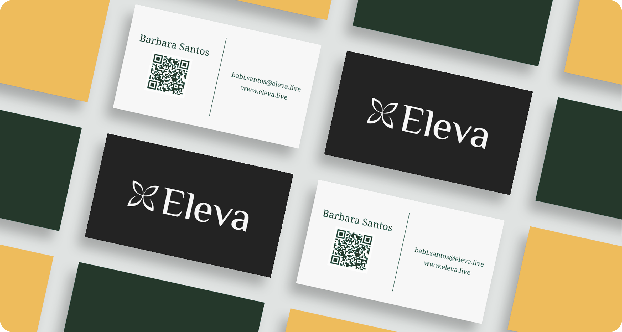
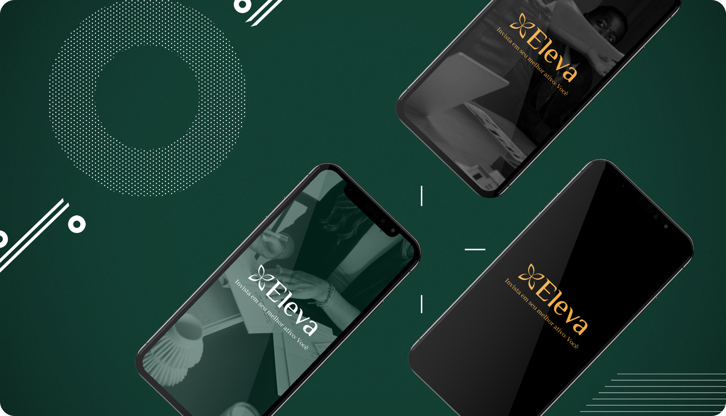
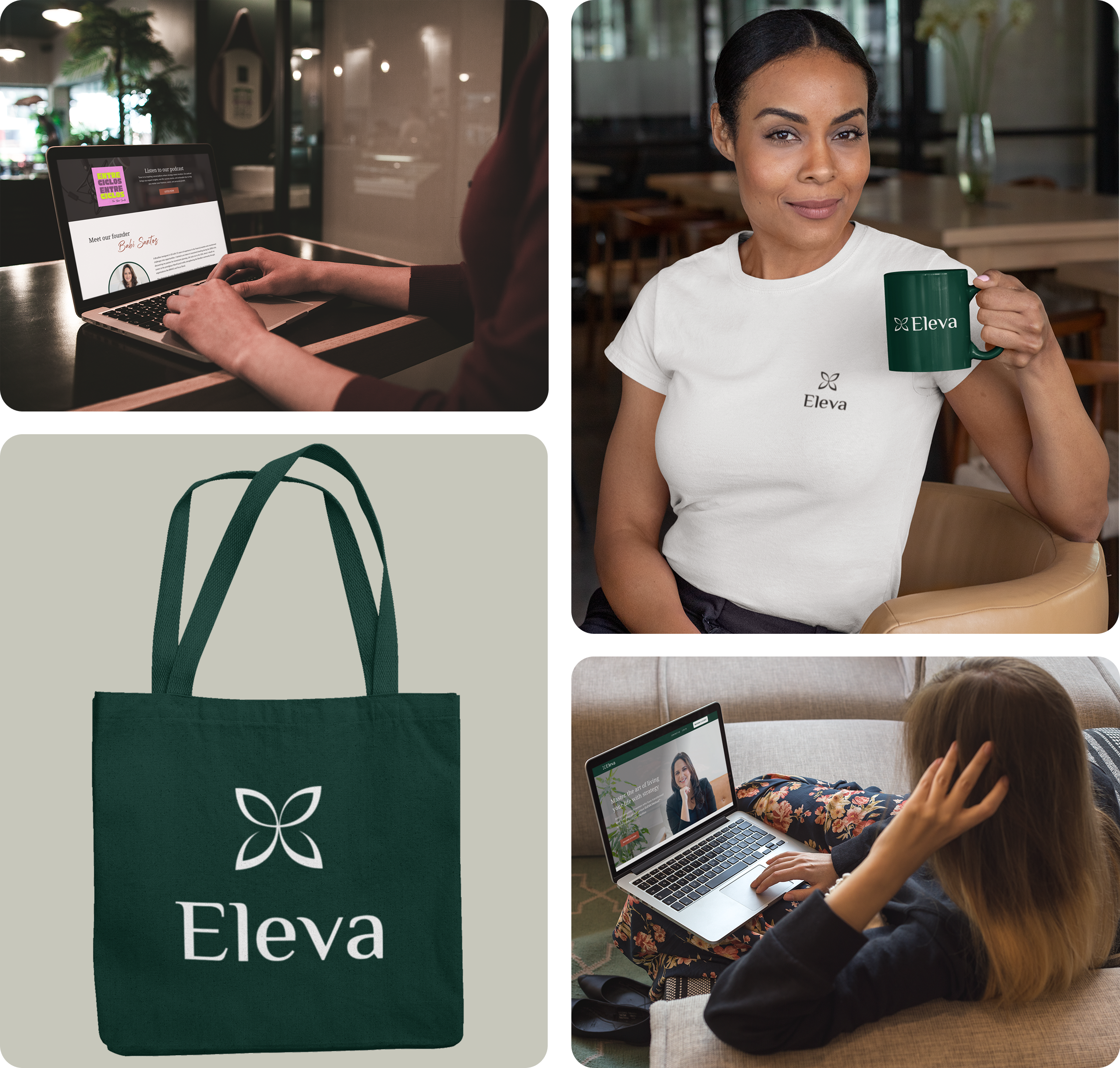
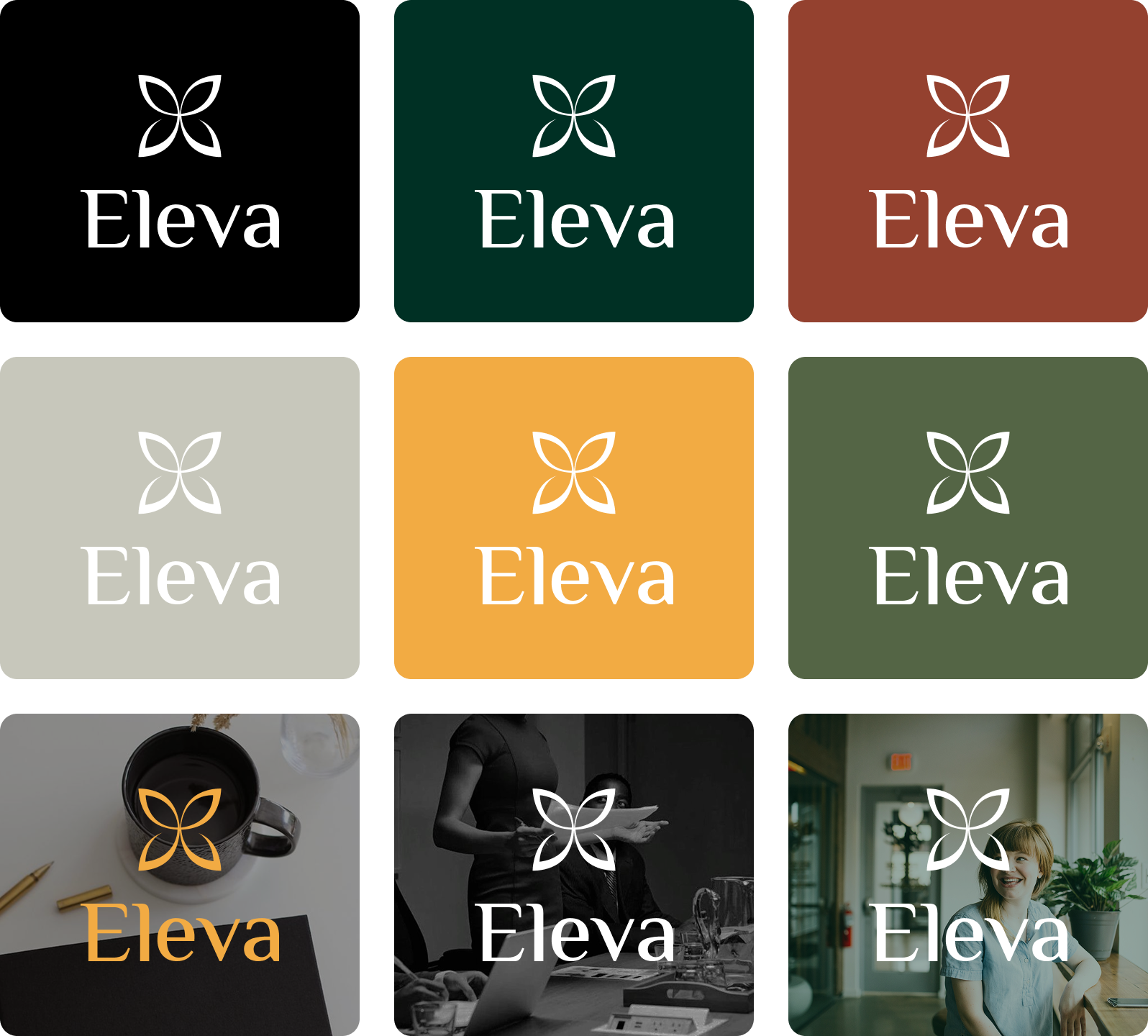
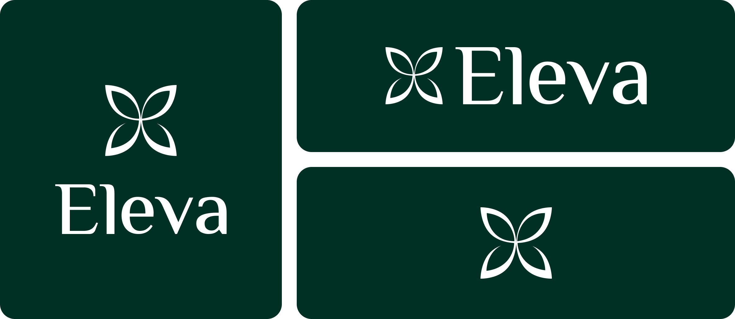
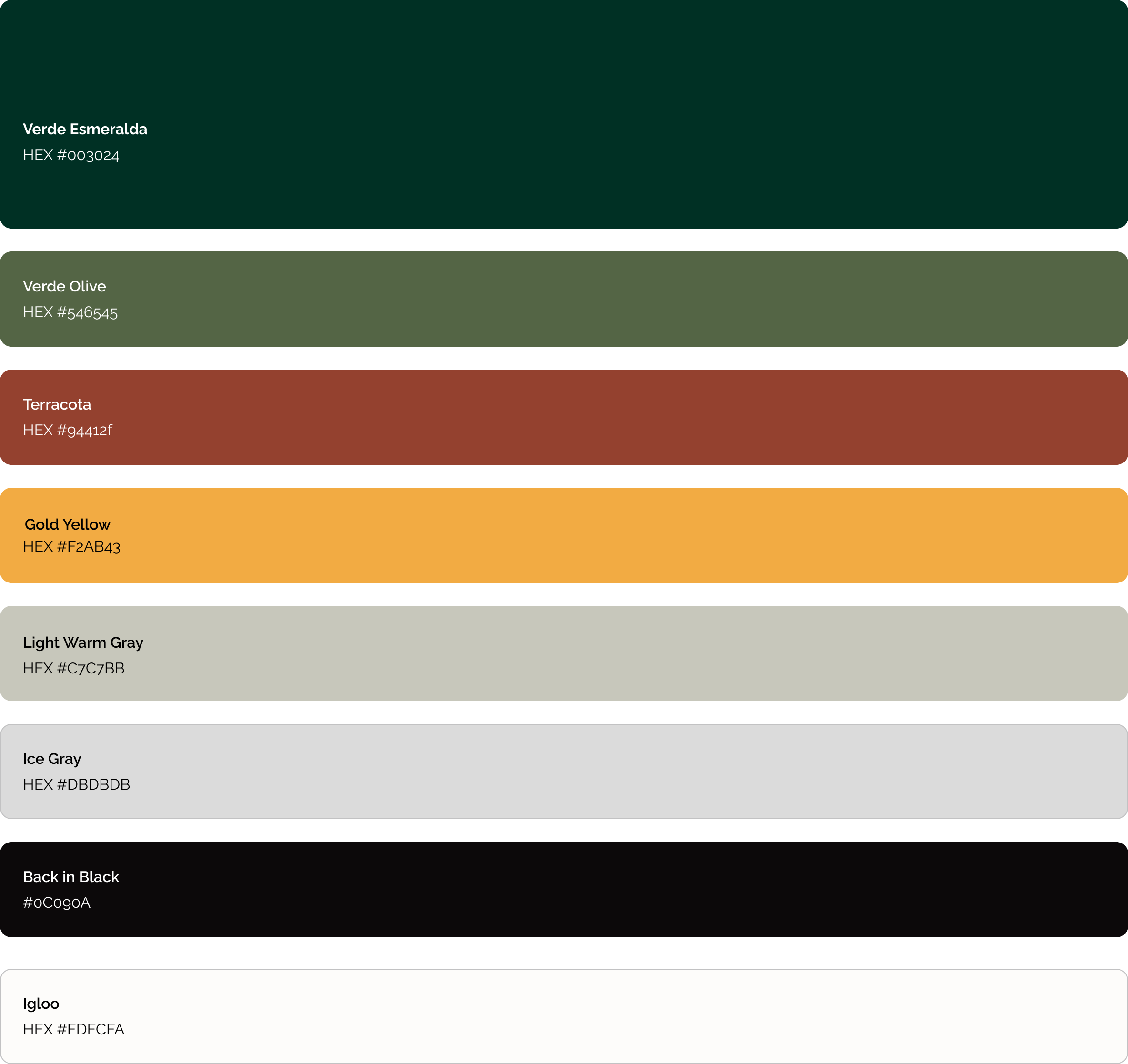
Then I turned strategy into an identity, and every visual choice traced back to a value. The symbol became a flower-slash-butterfly mark for transformation and growth, an organic, fluid form that carries a sense of lightness and movement. The palette pulled from nature, deep greens for growth, terracotta for passion and authenticity, ochre for energy, grounded by warm neutrals for balance. And the type paired an elegant serif with a clean sans, which is the "sophisticated but accessible" personality made literal.

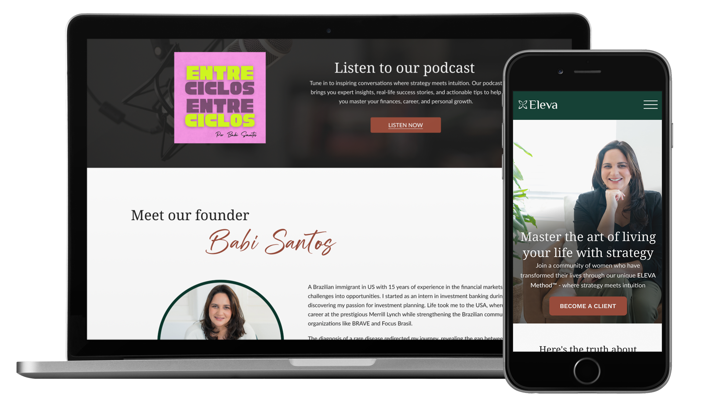
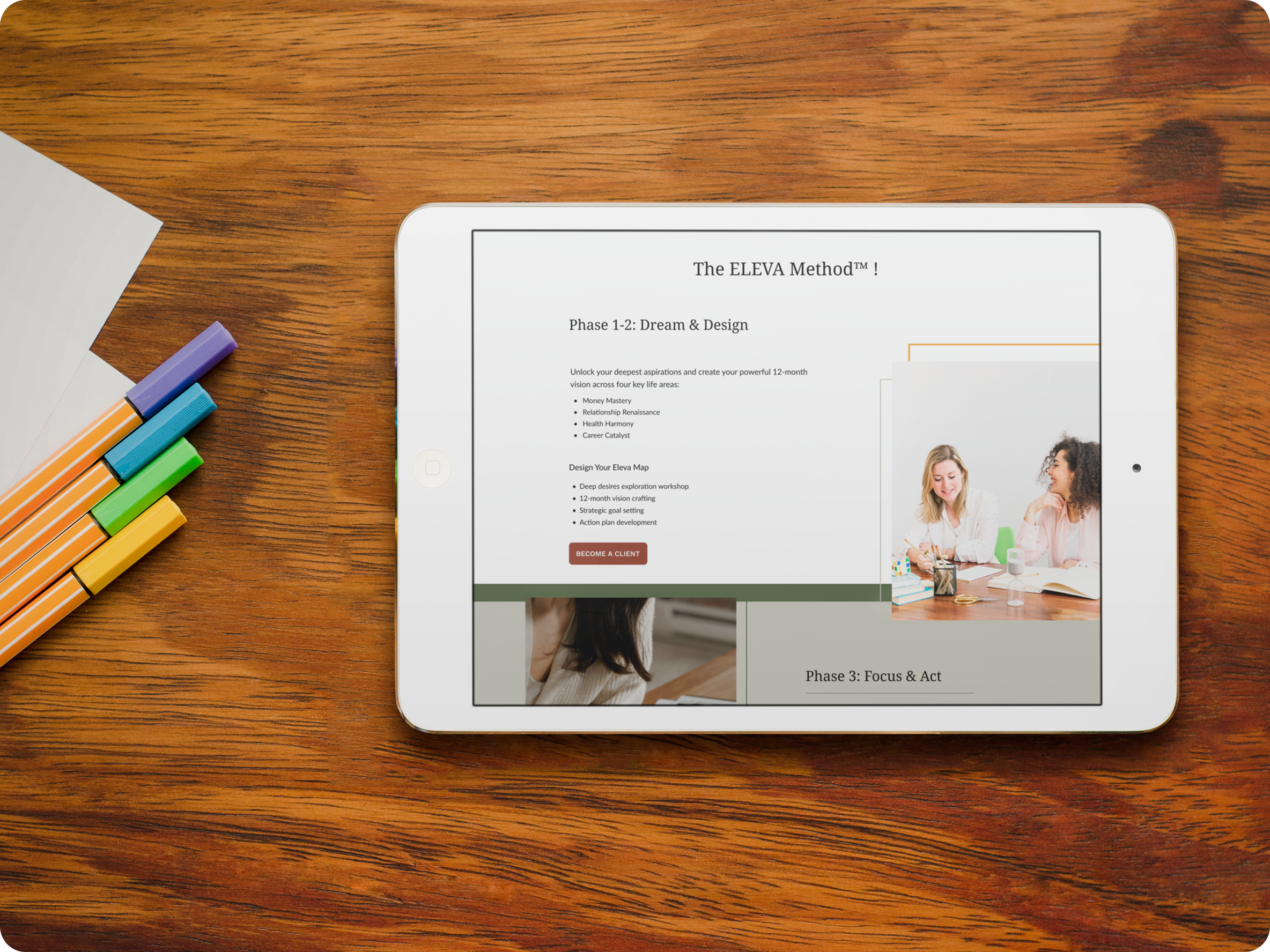
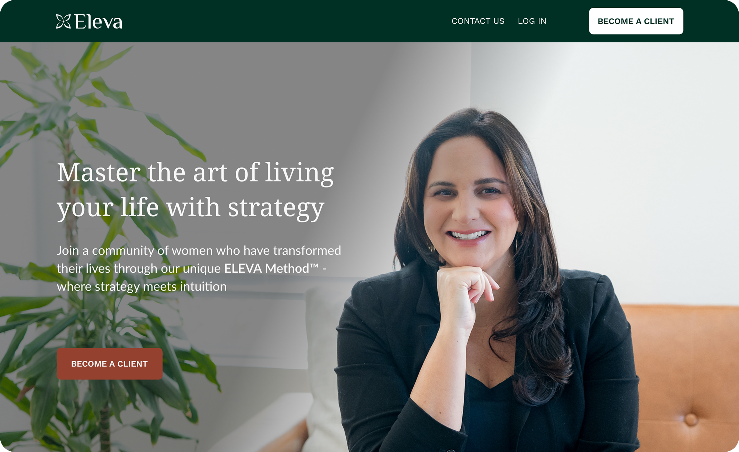
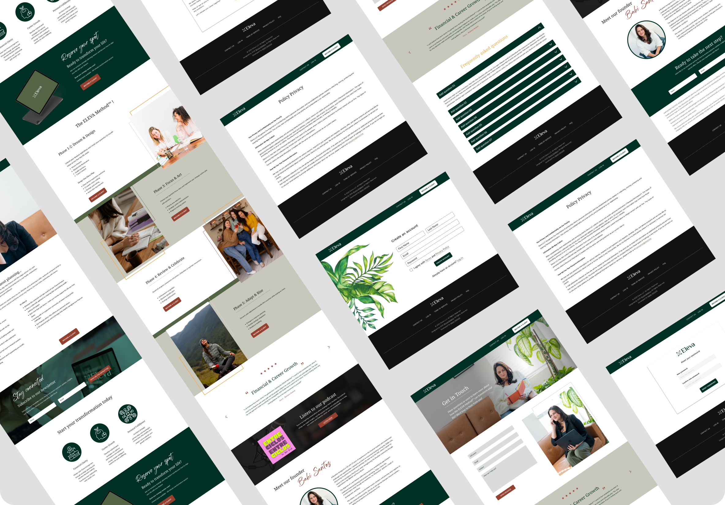
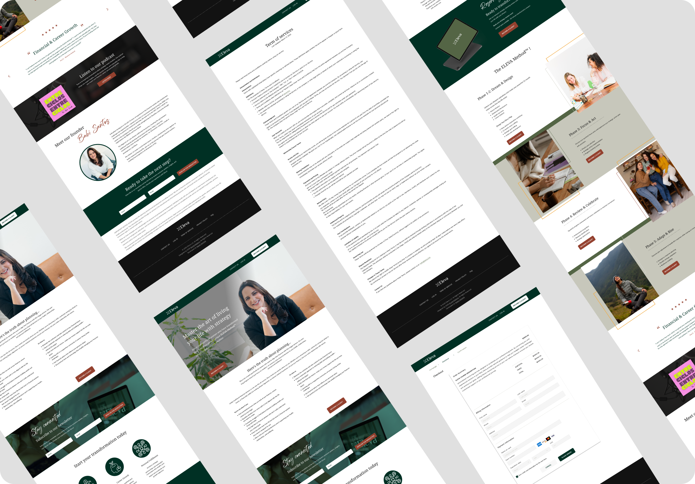
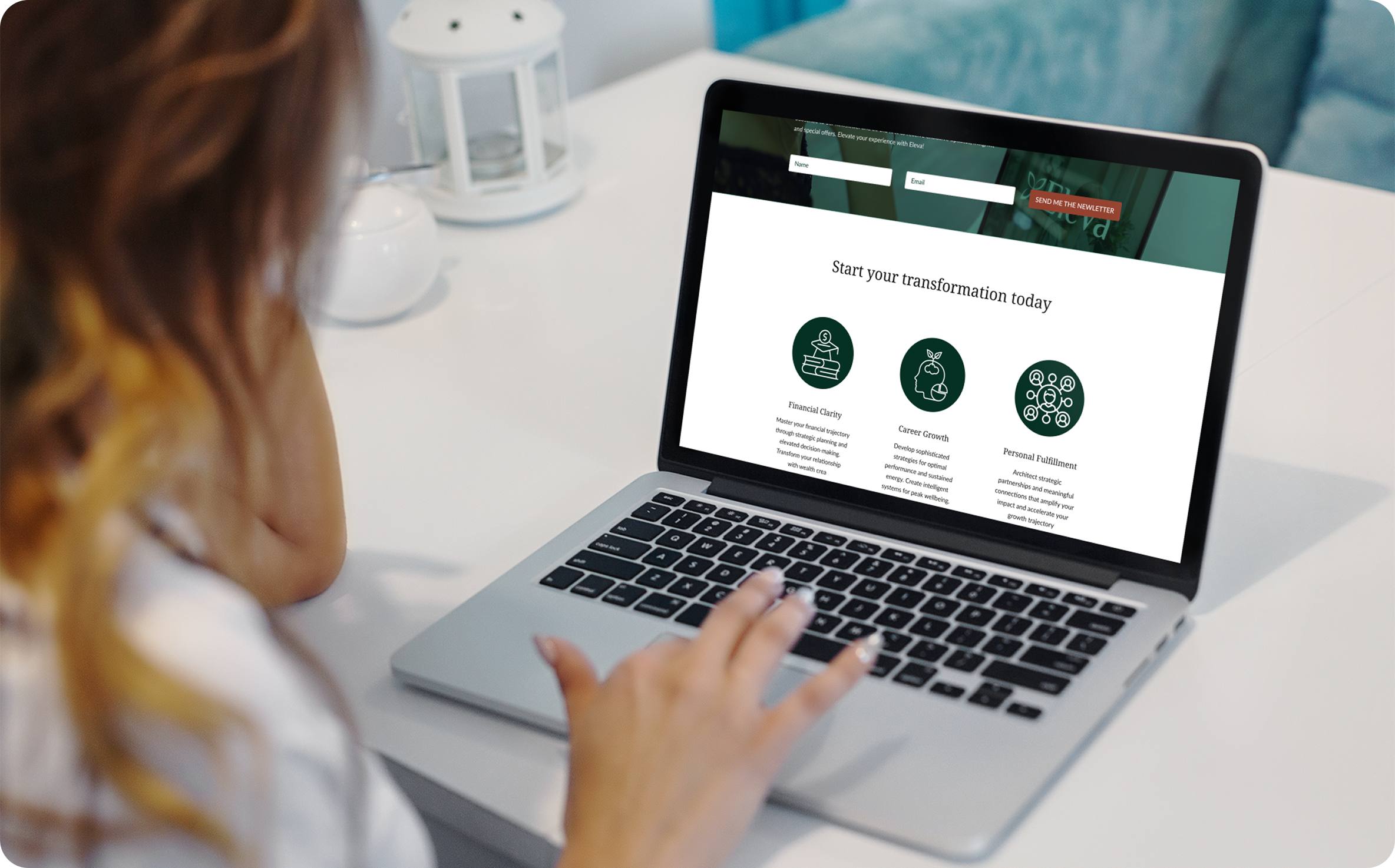
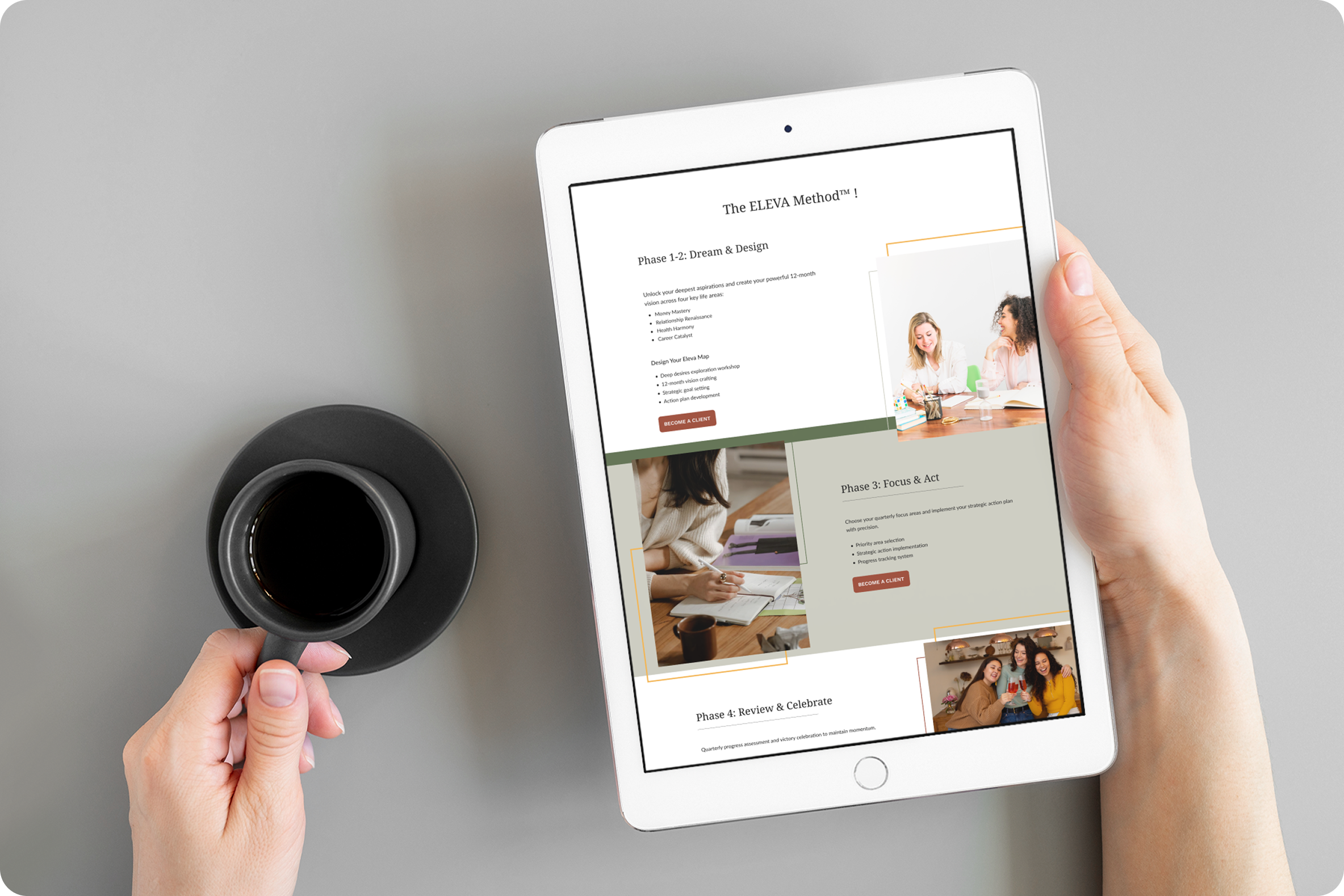
Finally, I translated that identity into the website itself. I built the architecture around the four pillars so a holistic method could read simply, shaped a guided journey that moves from the Eleva method to the founder's story to clear calls to action, and designed it mobile-first because the whole persona lives on her phone. Testimonials and an FAQ did the quiet work of earning trust along the way.
The decisions that mattered
A few choices set the tone. I leaned into the butterfly instead of the usual wellness clichés, because it could carry transformation without feeling generic. I chose a serene, earthy palette over the bright, loud look you'd expect from the self-help world, so the brand would feel the way the audience wants to feel. And I anchored the whole site on the founder's story, because the method really is her story, and that made it the most honest trust signal she had.
Result
What came together was a complete, coherent brand system, from strategy to visual identity to a launched website, all built from a blank page. Eleva ended up with a single, trustworthy front door that translates its methodology into something you can feel before you've read a word.
Reflection
I designed this working solo and fast, mostly from the founder's vision and my own internal reviews. If I did it again, I'd get a few women from the actual audience into the flow before build, so I could test that "curious to committed" journey with the people it was really for.